GreenChef: a zero-waste kitchen app
App & Web Design
2024
Student project
GreenChef is a zero-waste kitchen app that promotes eco-friendly, healthy habits and educates users on the impact of food waste.
Context
In 2024, I joined the Telerik Academy Upskill UX/UI Design program, where my team and I were tasked with developing a Zero-Waste Kitchen app over three months.
Throughout the program, I gained hands-on experience in the full product design lifecycle. Regular progress presentations helped me refine my skills as a versatile designer while learning to collaborate effectively with a team of strangers, ultimately enhancing my teamwork and design capabilities.
Brief
Develop a user-friendly website or app that promotes a zero-waste lifestyle through sustainable food consumption. The website or app should provide users with recipes and meal planning tools that prioritize low-waste ingredients and packaging, with a focus on reducing food waste.

My role
As my first UX project, I was eager to immerse myself in every stage, from UX strategy and research to UI design, prototyping, and animations. While I enjoyed the challenges of each area, I was especially passionate about accessibility and animation. My main areas of contribution included:
Crafting the layout and questions for user surveys
Group deliverables - Feature prioritization, User stories, Information architecture, User flows
Lo-fi wireframes - mobile - Recipe finder, My pantry, Onboarding; desktop - My Pantry, Sign up/Log in, Donate, Recipe details page
Visual and emotional moodboard creation
Logo creation
Design system and components
High fidelity prototype - mobile - Recipe finder, My pantry, Onboarding; desktop - My Pantry, Sign up/Login, Donate, Recipe details page
Prototyping - mobile and desktop
Moderated user testing and interviews
Extracting insights from user testing
Setting up Maze for unmoderated usability testing
Solving problems that emerged during the process and making sure design is consistent - checking all screens proper usage of typescale, spacing, color, etc.
Continuously giving and receiving feedback
Active role in team synchronization and organization of the work process

Challenge
Design an intuitive, user-friendly app that encourages healthier consumption habits and reduces food waste, while educating users on its environmental impact. The goal was to create a seamless experience that makes adopting sustainable practices easy and accessible.
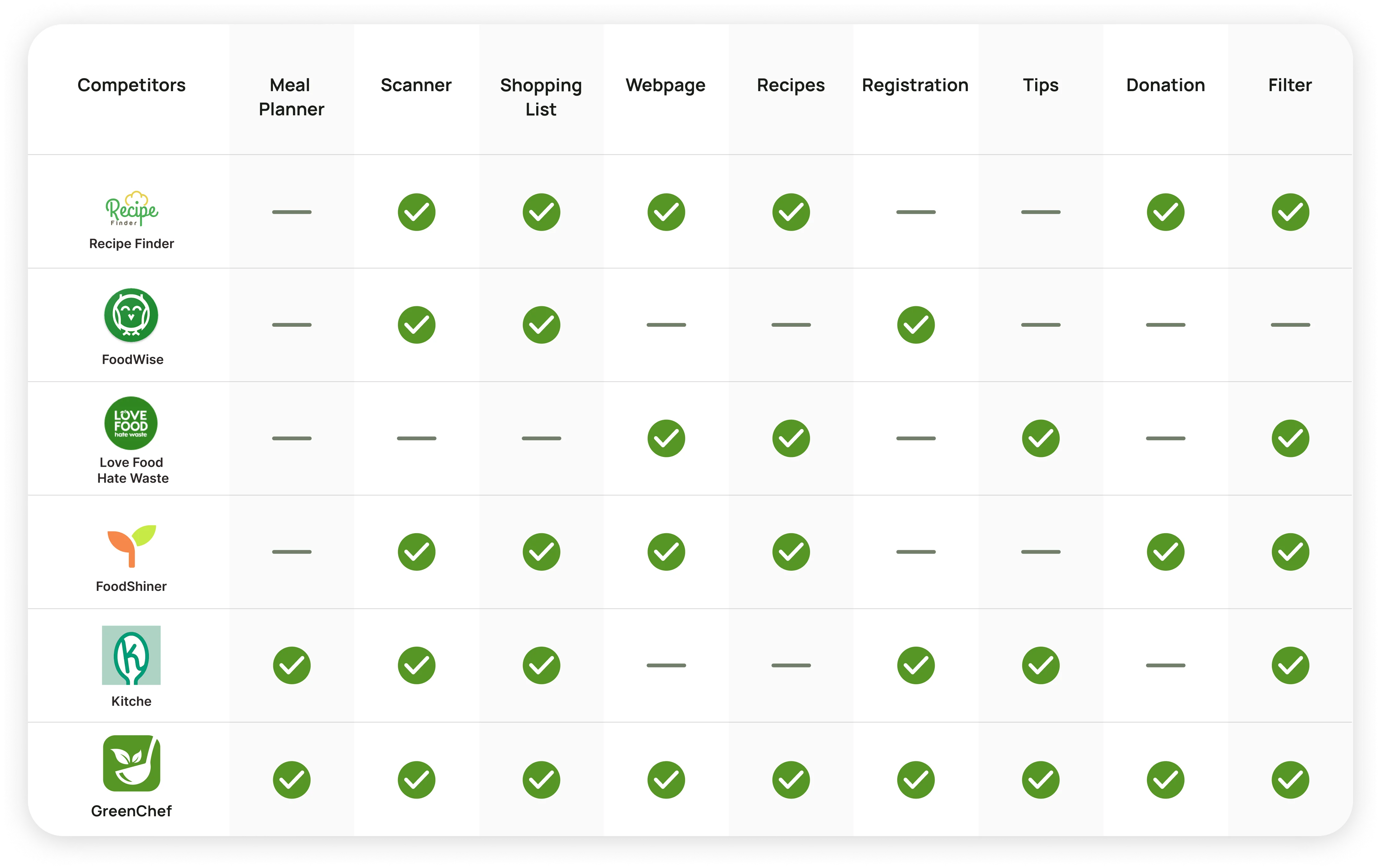
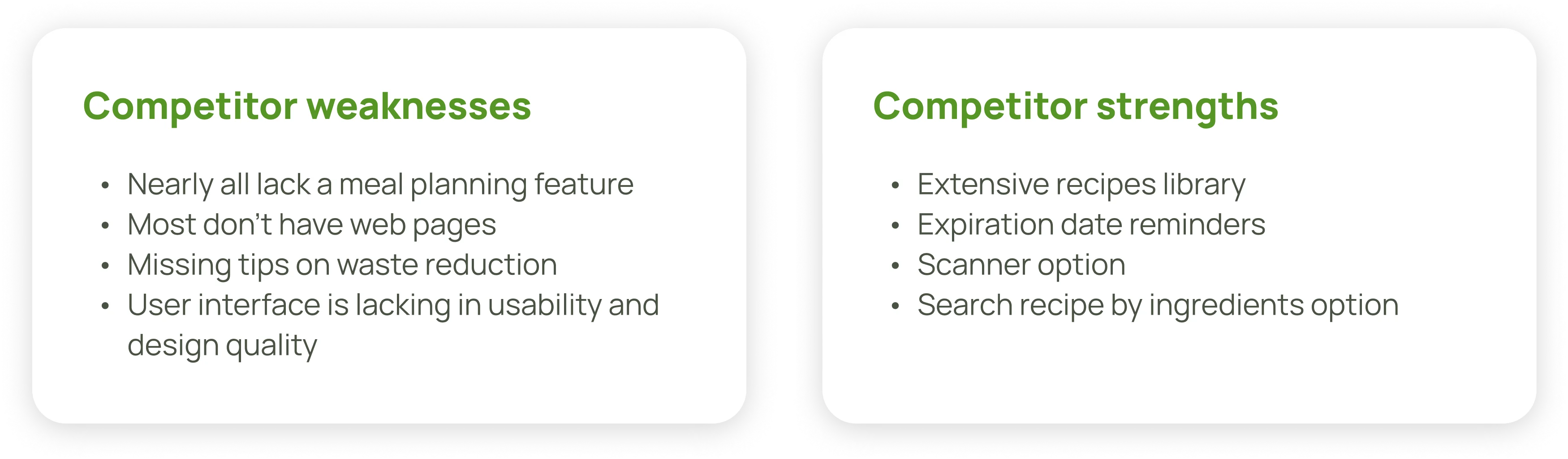
Taking our first steps into the project and into the world of UX, we started looking for what was already made.
The competitor analysis clearly showed us the strengths that we can follow and the gaps in our competitors' products we can fill. A major takeaway was that all failed to create a complete experience that helps users combine a healthy lifestyle and environmentally friendly way of living, so we aimed to fill this niche.
My contribution: Synthesizing the competitor strenghts and weaknesses.
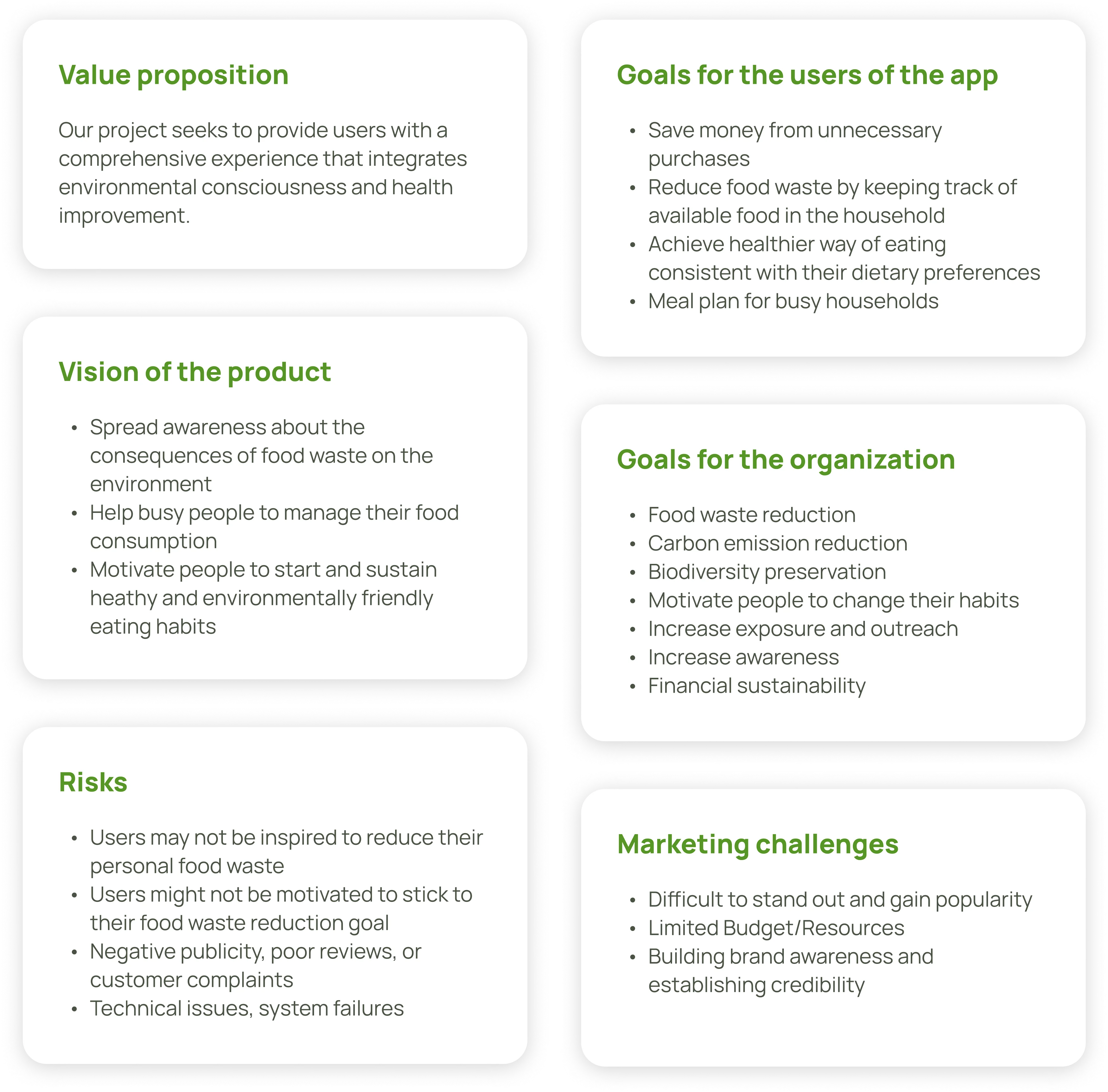
What needs to be achieved?
Since the client and stakeholders were fictional, we defined the product’s values, vision, and goals through extensive competitor research and environmental non-profits. We split the goals into two categories: those benefiting users and those aligning with the organization’s objectives. We also identified potential risks and marketing challenges.
Developing the business strategy was a collaborative effort that pushed us beyond our comfort zones, but it was essential in setting a clear direction for the product's future.
My contribution: Crafting the Value proposition, Vision, and Goals for the project
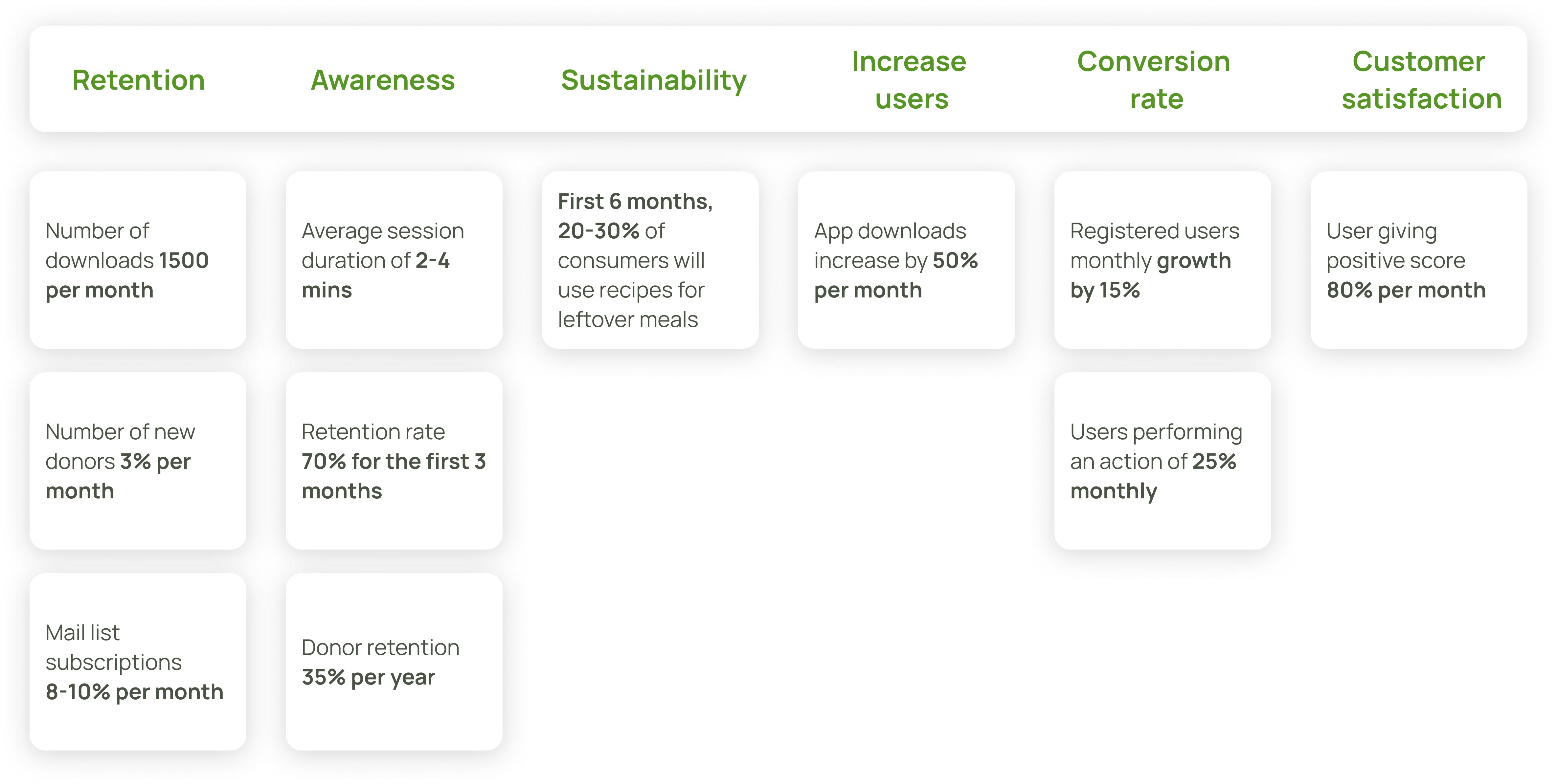
How to measure success / KPIs
How do we know we've reached the goals we've set? We set a number of measurable markers to help measure the impact of the project. It was important for us to measure the engagement of users, but we also put effort in finding a way to follow the environmental impact of the app.
My contribution: General research and formulation of the sustainability indicator.
Who are our users?
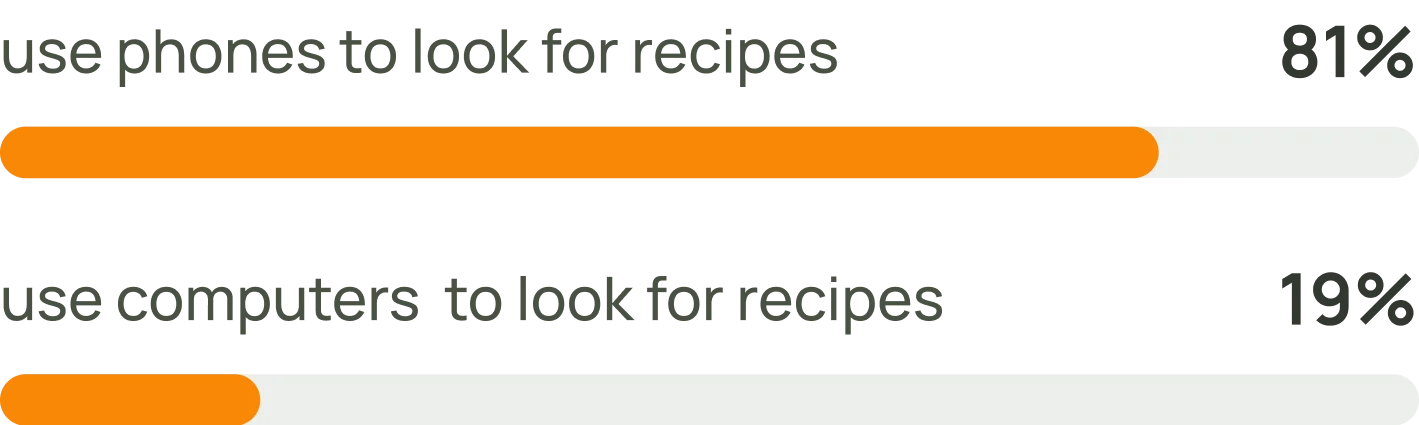
59 people were surveyed to collect demographic data for the application. We wanted to understand the demographic profile of our potential users, their cooking habits, and their level of engagement with environmental preservation and healthy living. We reached out to people from our personal networks and also from online groups focused on cooking and environmental protection.
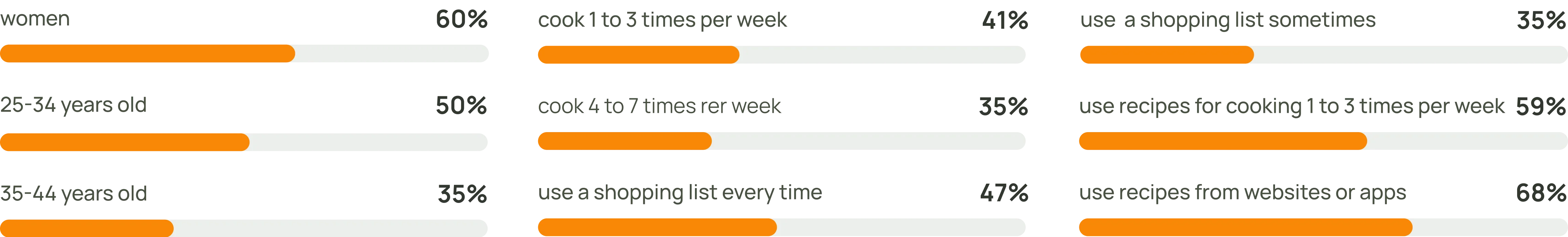
Demographics survey results
To recruit volunteers for in-person interviews, we asked survey participants to leave their contact info. We screened responses and found five candidates who matched our criteria and were willing to participate.
My contribution: I was responsible for developing and refining interview questions, distributing them to users, and synthesizing the results.
Why mobile first?
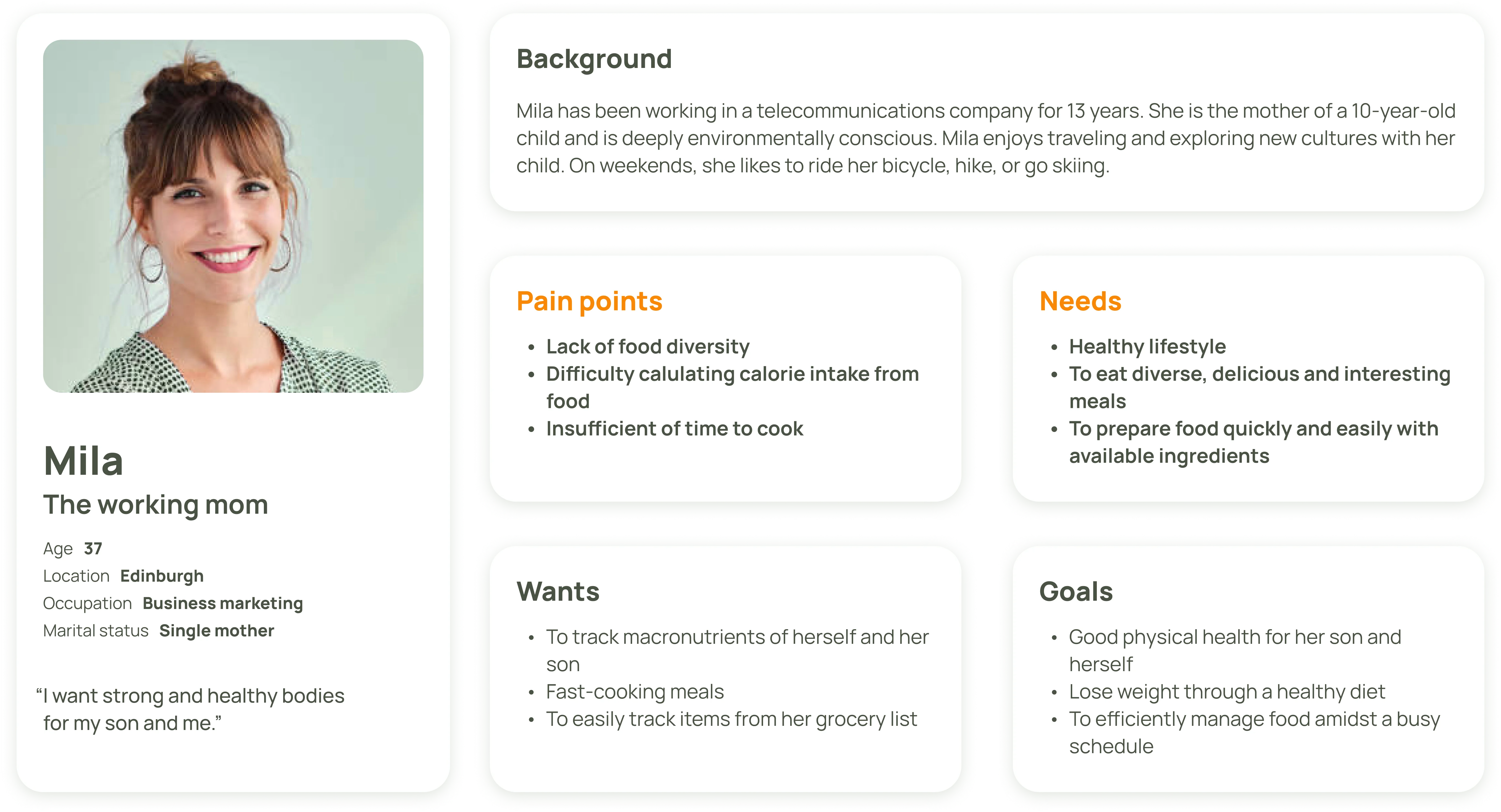
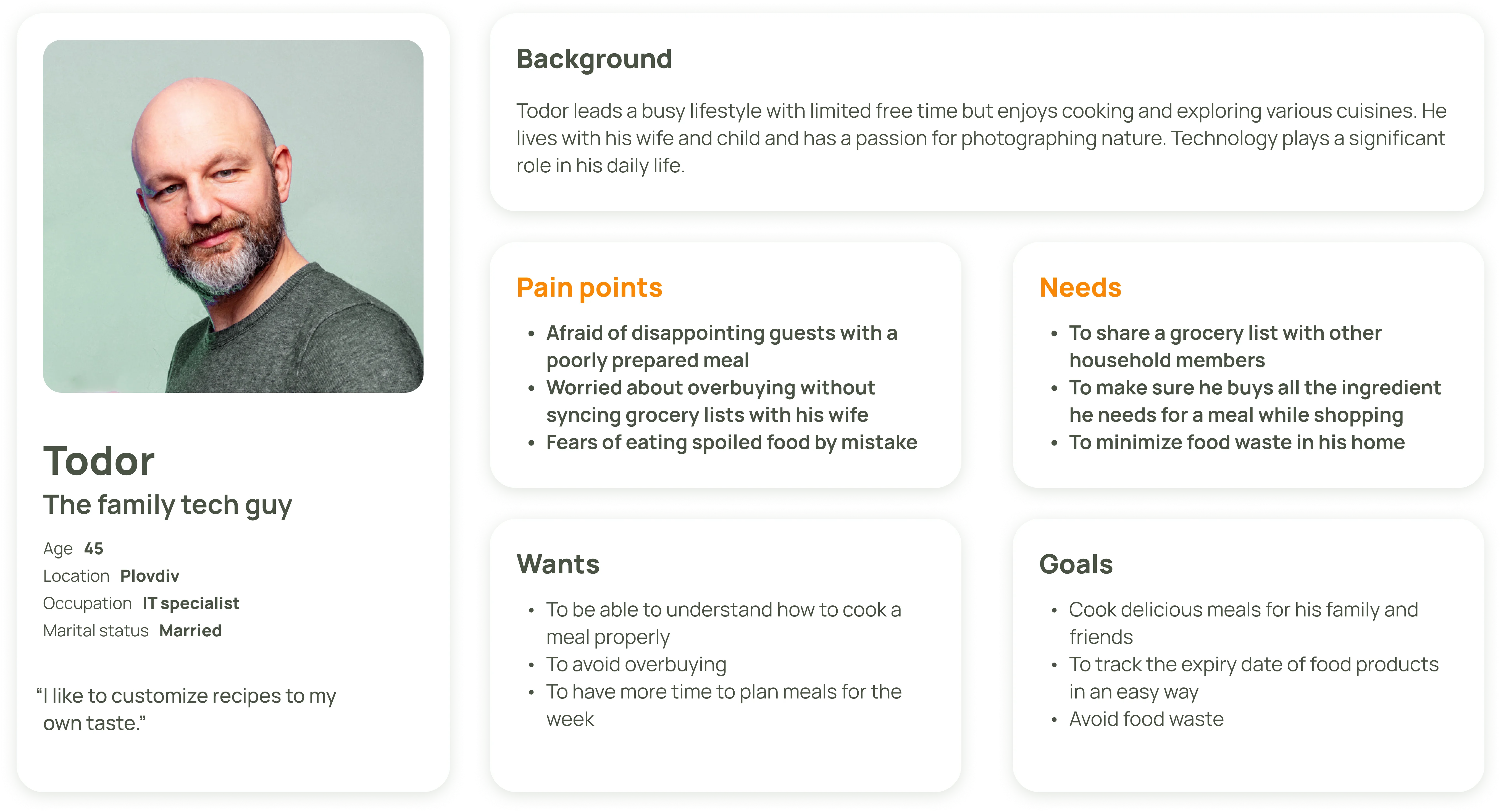
Understanding users’ needs
5 in-person interviews and 59 survey answers started to paint the picture of who our users are and outlined their needs and frustrations. Based on the collected info we developed our personas and started to understand the needs we need to meet.
My contribution: This was a group effort, in which I focused on synthesizing interview insights and identifying key pain points and user needs.
The user stories we developed after the personas directly influenced our app's potential features, ensuring alignment with the target audience's needs and goals. This approach kept our product development focused on real user requirements, leading to a truly user-centered design.
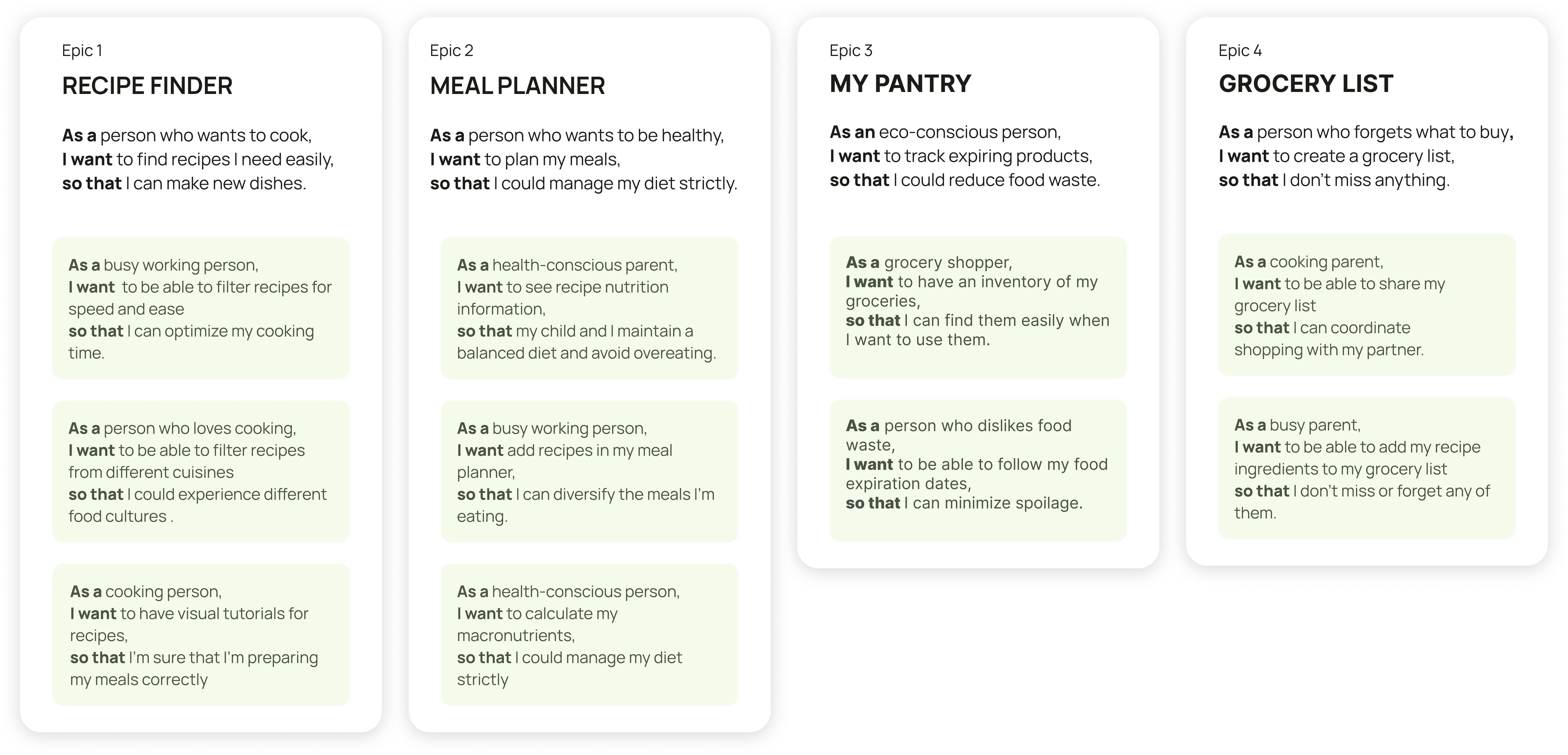
This was a collaborative effort, with everyone actively involved in shaping each story and epic.
Feature brainstorming session
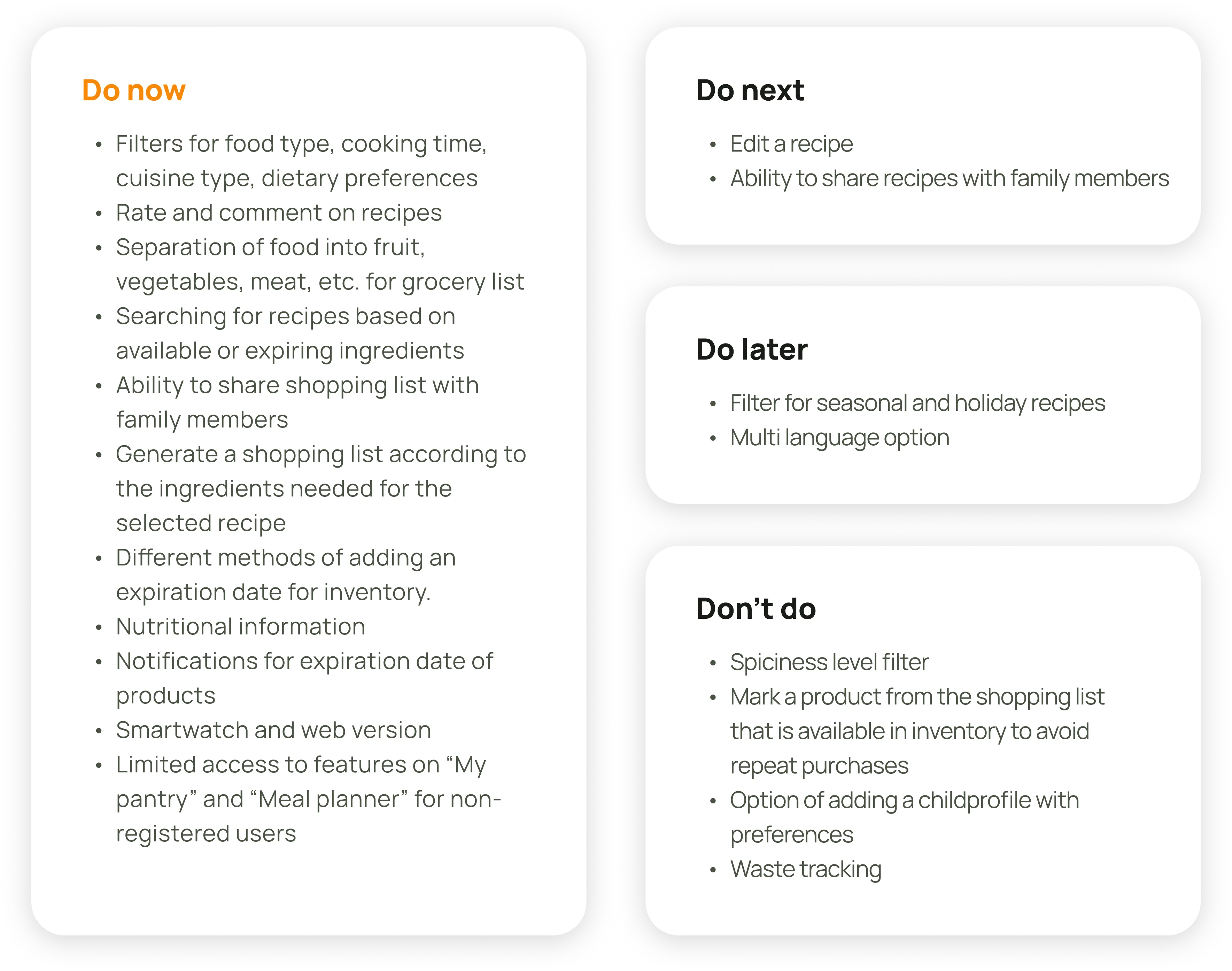
We identified 4 key functionalities based on user needs and brainstormed features for each in 10-minute sessions. Though chaotic, the session produced many ideas, which we organized and prioritized using the Value vs. Cost method, deciding which features to focus on, defer, or discard.
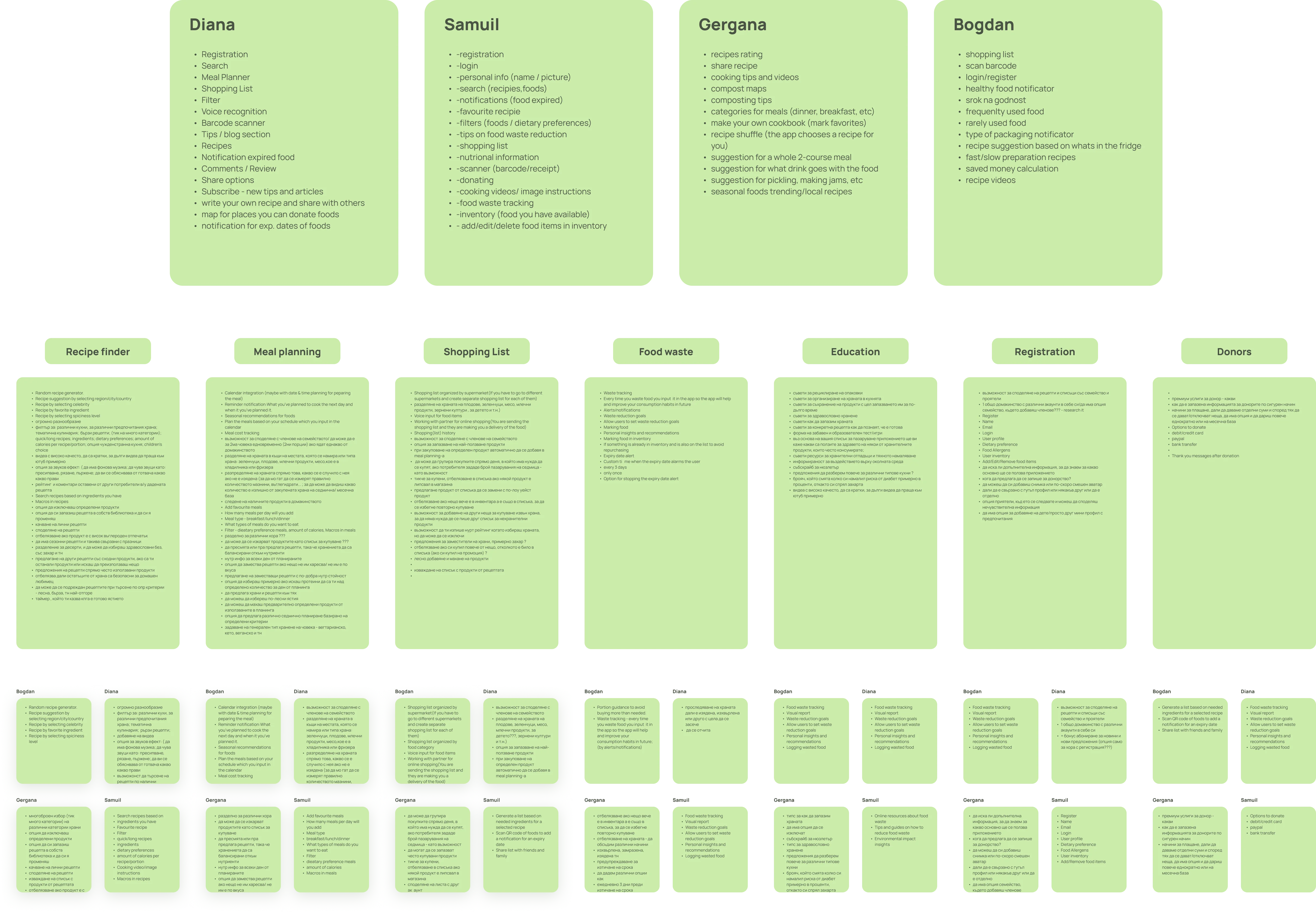
My contribution: Leading the brainstorming session; the prioritization was a collaborative effort.
Information architecture
With the scope defined in earlier steps, we focused on establishing the structure and building a solid foundation for the next phases. Prioritization guided us in designating the mobile app as our primary platform and the web version as secondary, allowing us to distinguish between the two.
This was a group effort.
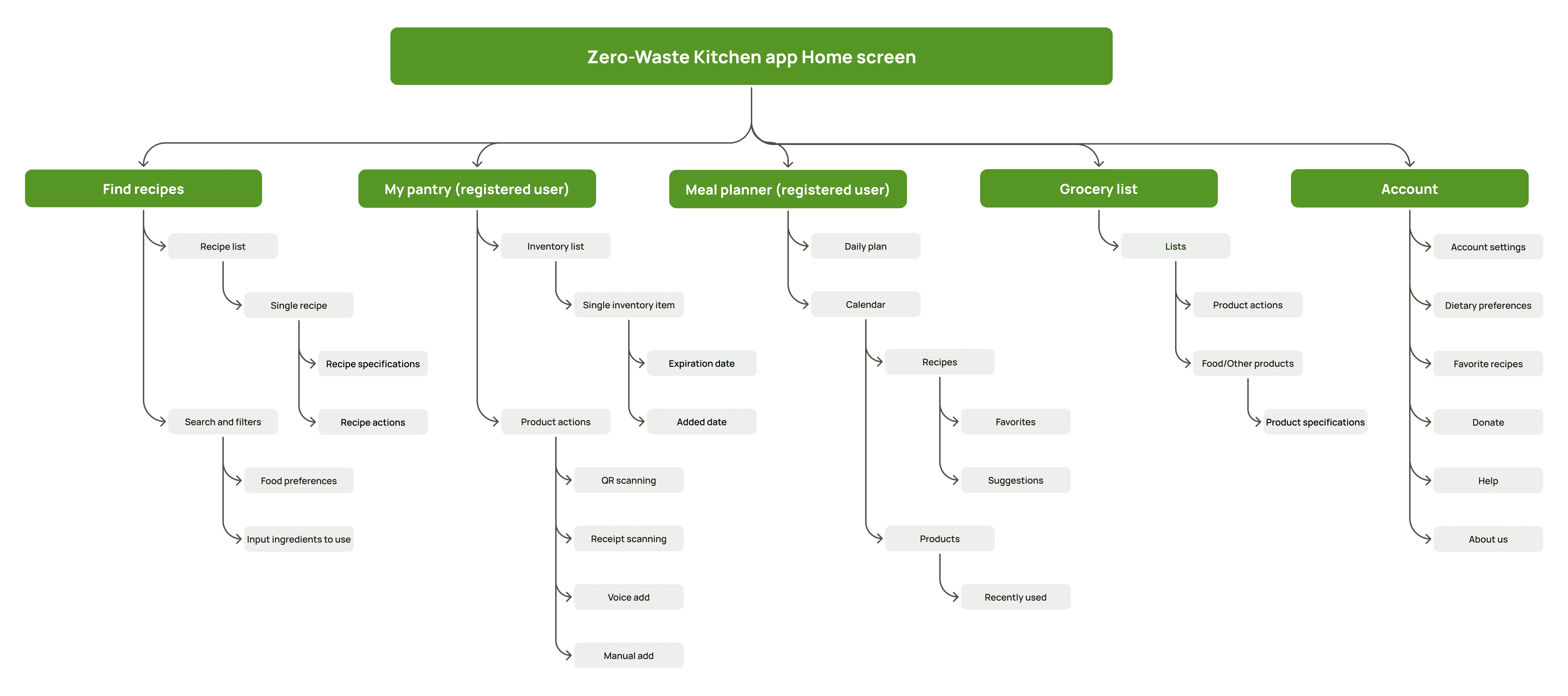
Mobile Information architecture
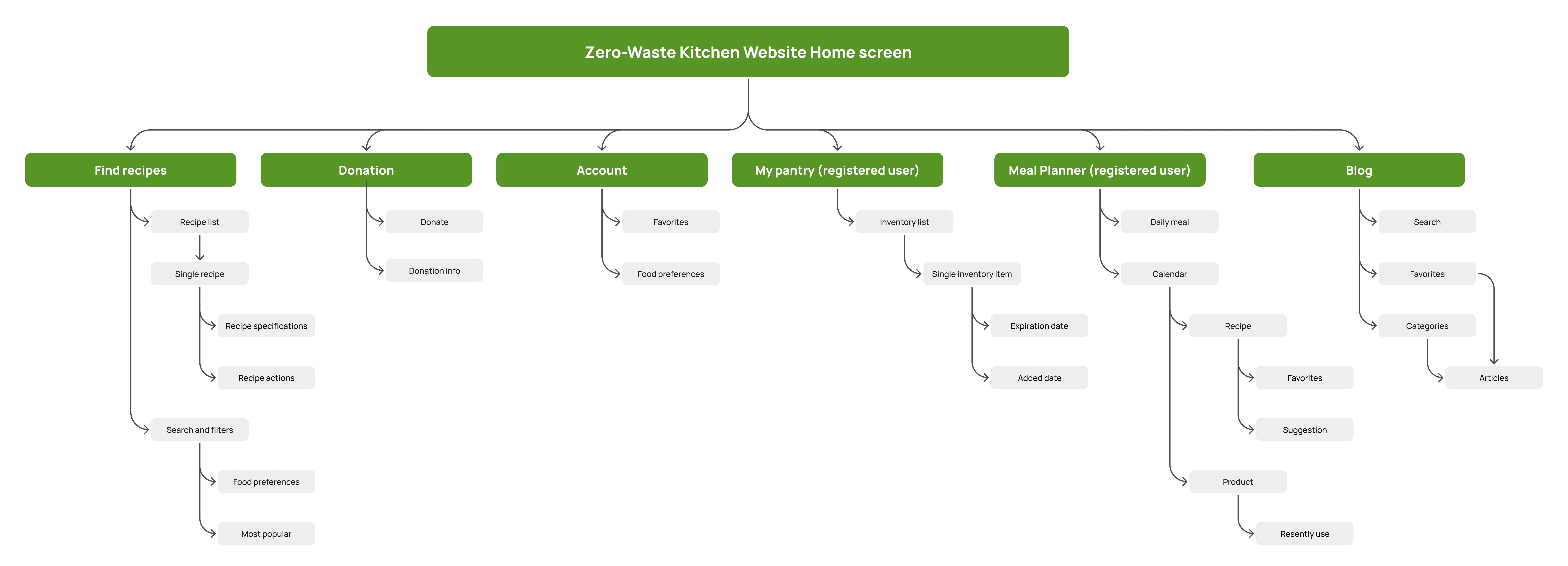
Web Information architecture
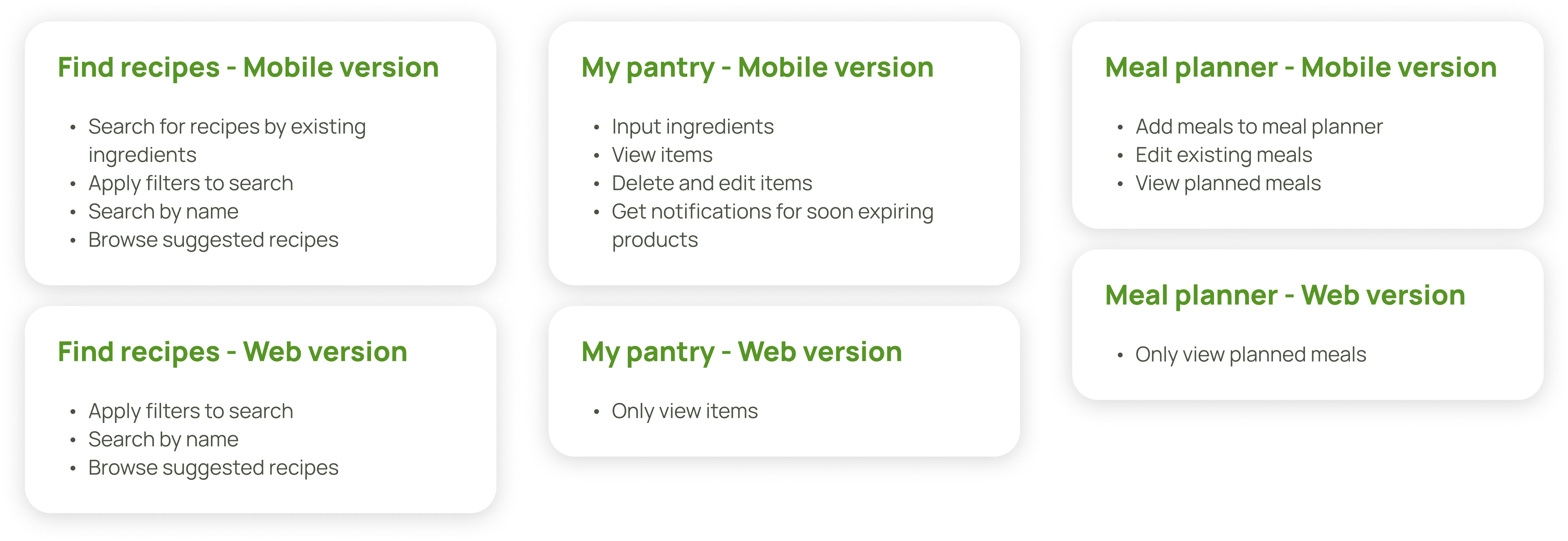
Difference between mobile and web version
We created user flows to map out the sequence of actions, ensuring a smooth and intuitive user experience.
We crafted user flows following the user stories under the epics of the main 4 functionalities, plus Sign up flow. As almost all of the work, this was a group effort.

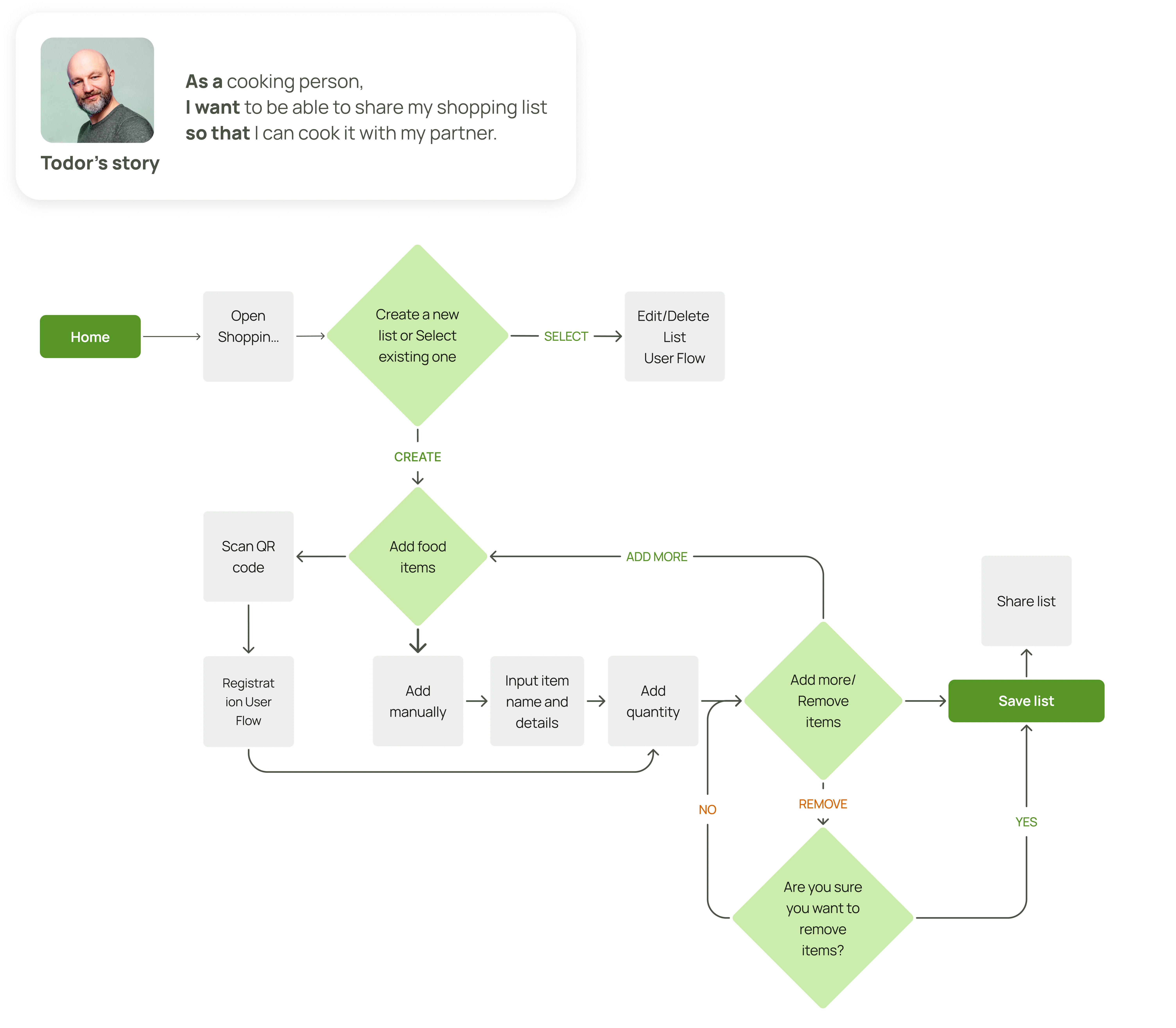
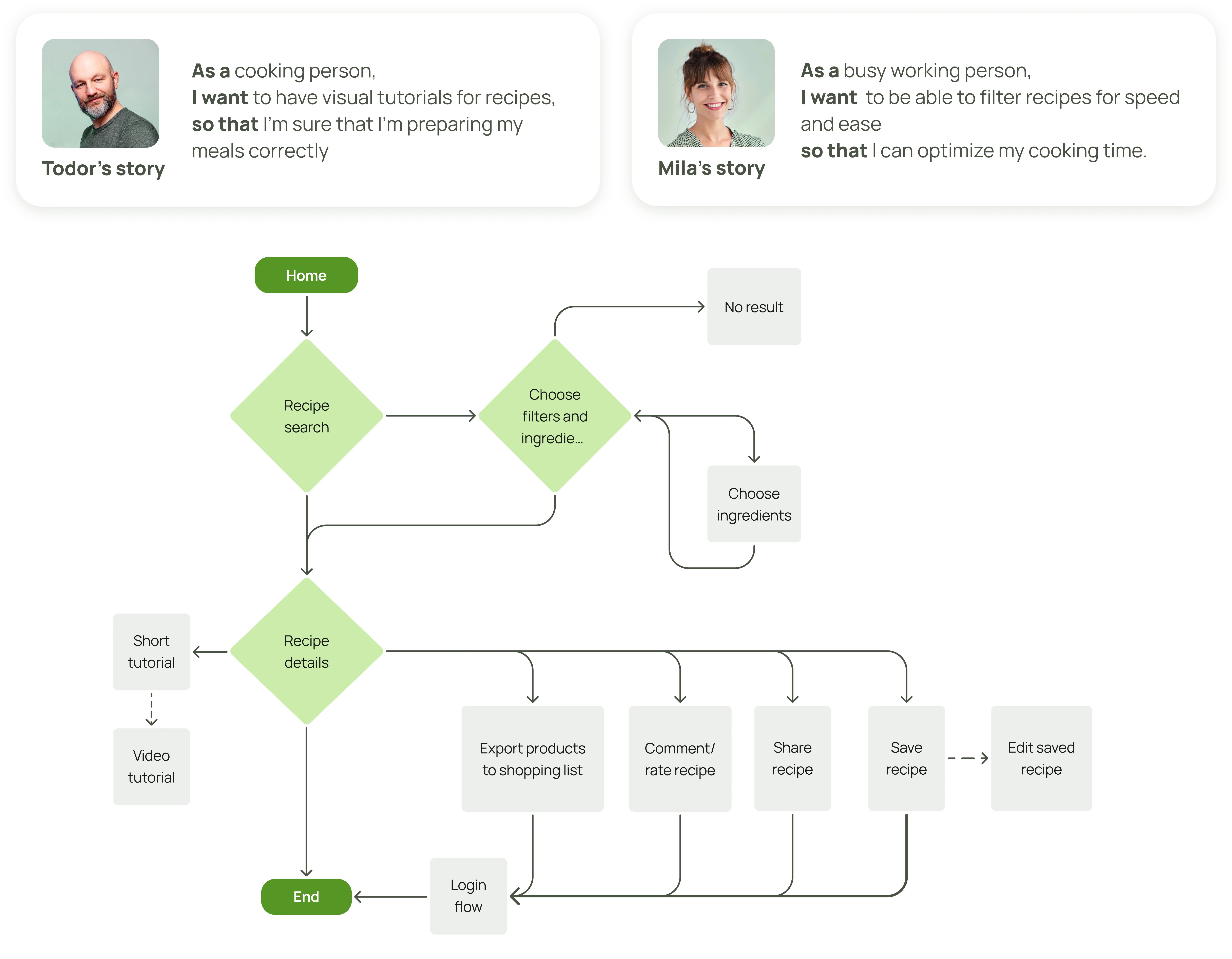
My contribution involved being responsible for designing the user flows for My Pantry and joint effort with another team member for Recipe finder, as well as giving feedback on teammates's flows.
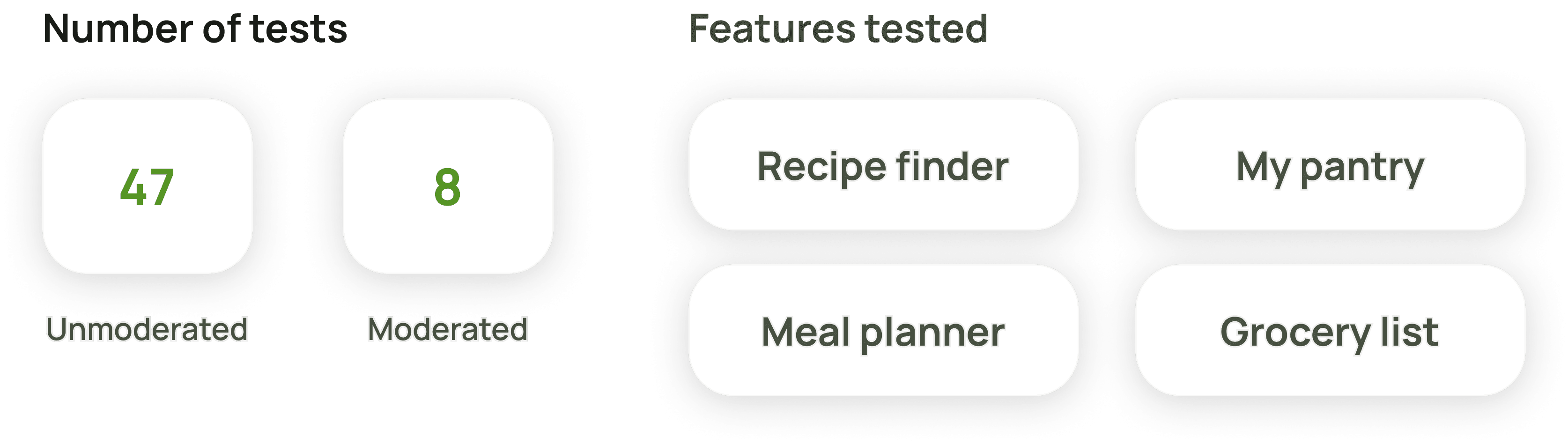
Wireframe testing
We ran two rounds of testing—one moderated, one unmoderated. The unmoderated Maze tests were inconclusive due to user curiosity and unfinished screens, but the moderated tests provided clearer insights through direct observation and follow-up questions.
My contribution involved preparing prototypes for user testing, setting up Maze tests, distrubiting tests to users and analyzing results.
Designing the visual identity with a focus on user needs and accessibility
Emotional moodboard
It was time to bring our app to life with color and form. Staying true to user-centered design, we turned to our personas for guidance.By understanding their pain points and needs, we identified a list of negative emotions users experienced. We then matched each of these emotions with a positive counterpart we wanted users to feel. Together with the user descriptions we distilled them to a list of keywords that encoded the direction to the visual design solutions to those problems.
My contribution: I was solely responsible for creating the emotional moodboard.
Visual moodboard
Using the keywords we developed, each team member created a moodboard, which we then presented to potential users for feedback. Based on their feedback, we refined the designs and finalized the visual moodboard.
Test moodboards from each member of the team
Final moodboard
My contribution: Creating a test moodboard, distributing to test subjects. The anlysis of the results of the user testing and final moodboard was a group effort.
User testing of colors
We selected the two busiest screens and each of us created a design sample, using colors from the moodboard and organizing them according to our individual design preferences. Naturally, we tested these with users. In addition to the screens, we tested four font combinations—two pairs featuring a primary and an accent font.
Test screens for different color combinations
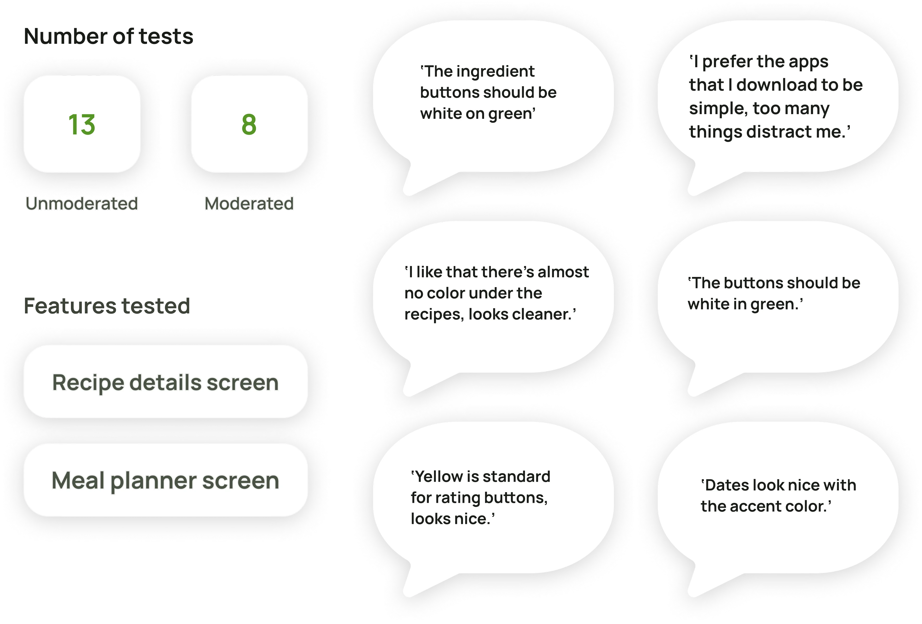
My contribution: Creating test screens, distributing to test subjects, conducting interviews. The anlysis of the results of the user testing and final moodboard was a group effort.
Design system – ensuring seamless consistency across platforms and between designers
Guided by our keywords and user feedback, we designed the elements of our system to feel friendly and approachable. Rounded corners, high contrast for clarity, and soft shadows to create a sense of lightness were key principles.
We developed various button sizes, cards, and navigation for both the mobile app and website, while maintaining consistency across platforms to ensure a seamless user experience.
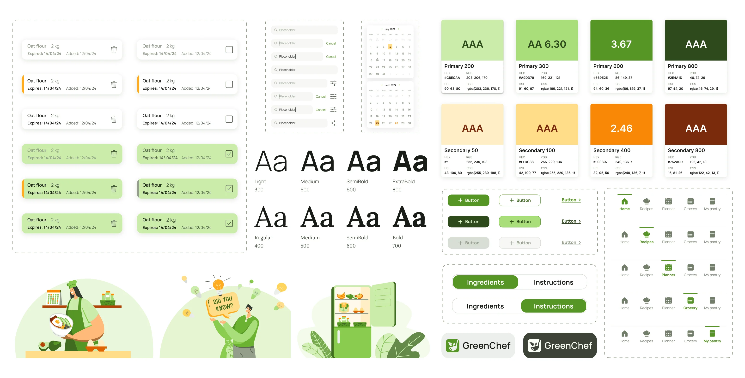

My contribution: I took a leading role in creating and systematizing the design system.
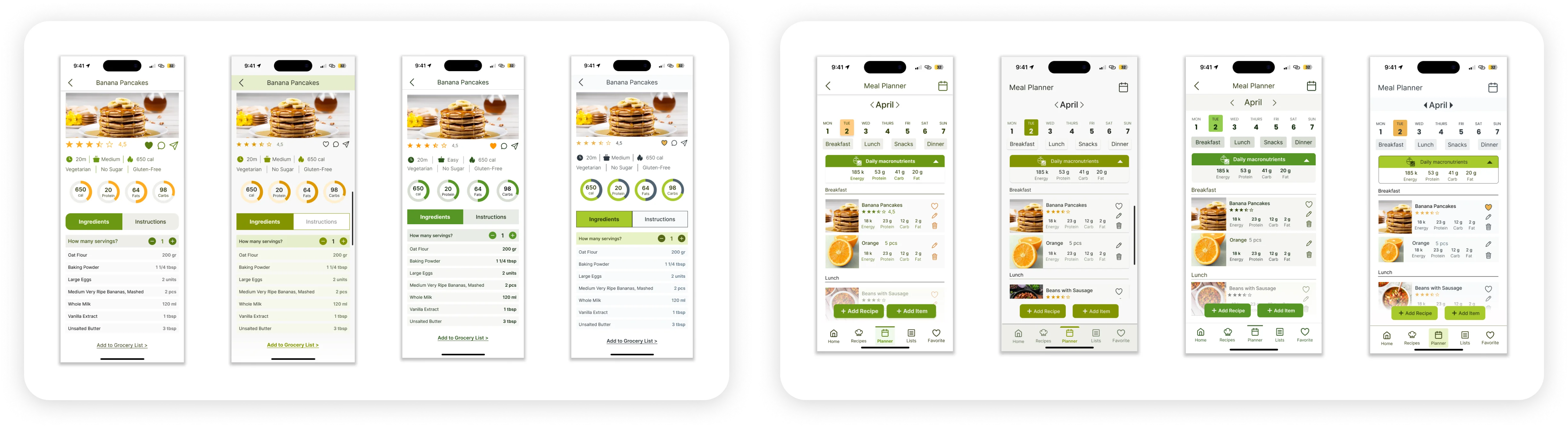
Usability testing and iterations of Hi-fi prototypes
Next, we’ll dive deeper into the development and testing of the My Pantry screens.
We conducted both moderated and unmoderated tests on two user paths within the My Pantry flow.
Unmoderated tests showed lower success rates, mainly due to Maze's limitations and the inherent nature of a not fully functional prototype. Users were curious, exploring more than expected, which caused deviations. Despite this, they found tasks easy, though we identified areas for improvement.
Moderated tests yielded similar results—positive feedback on the app and My Pantry feature, but with room for enhancement.

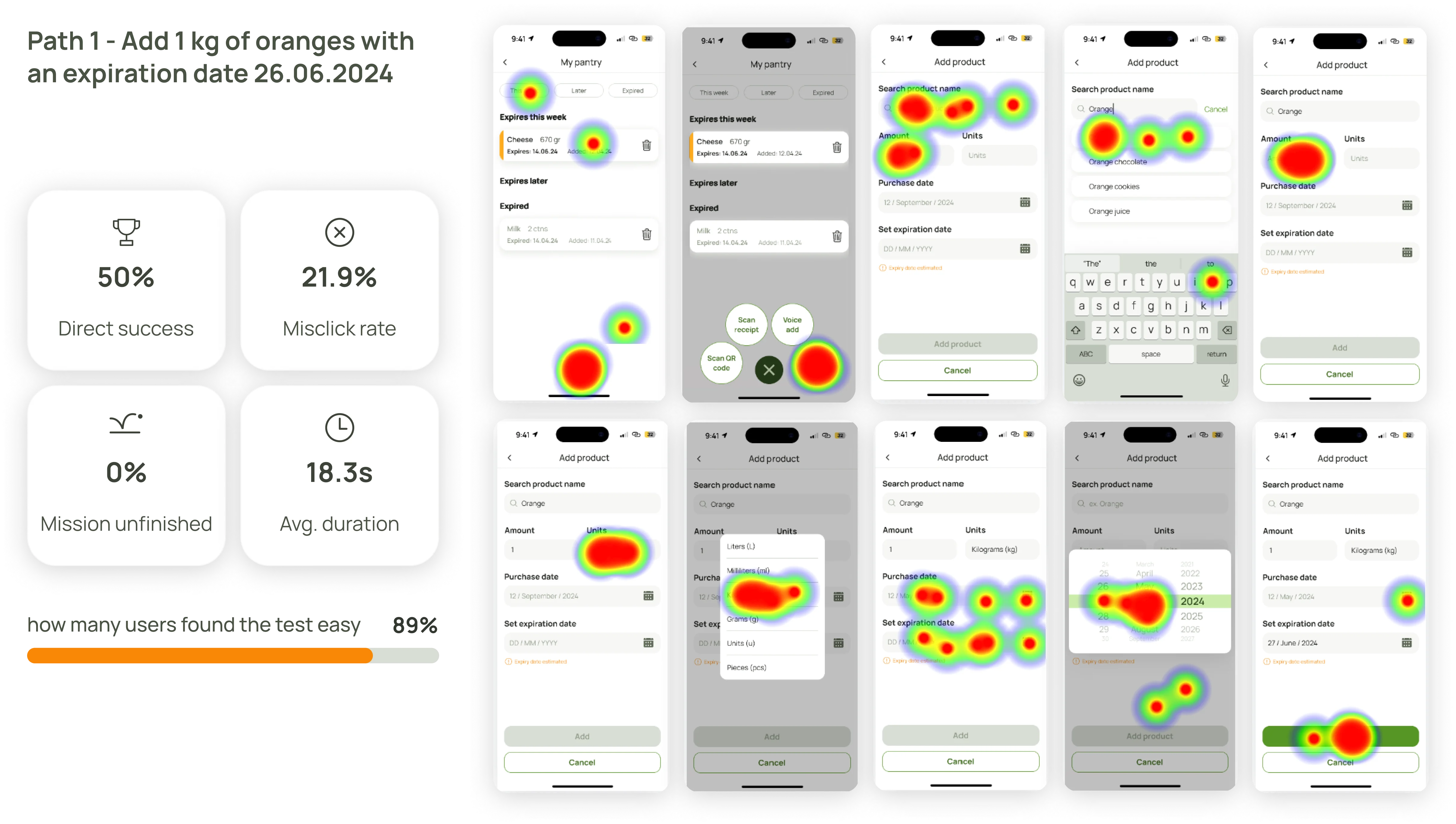
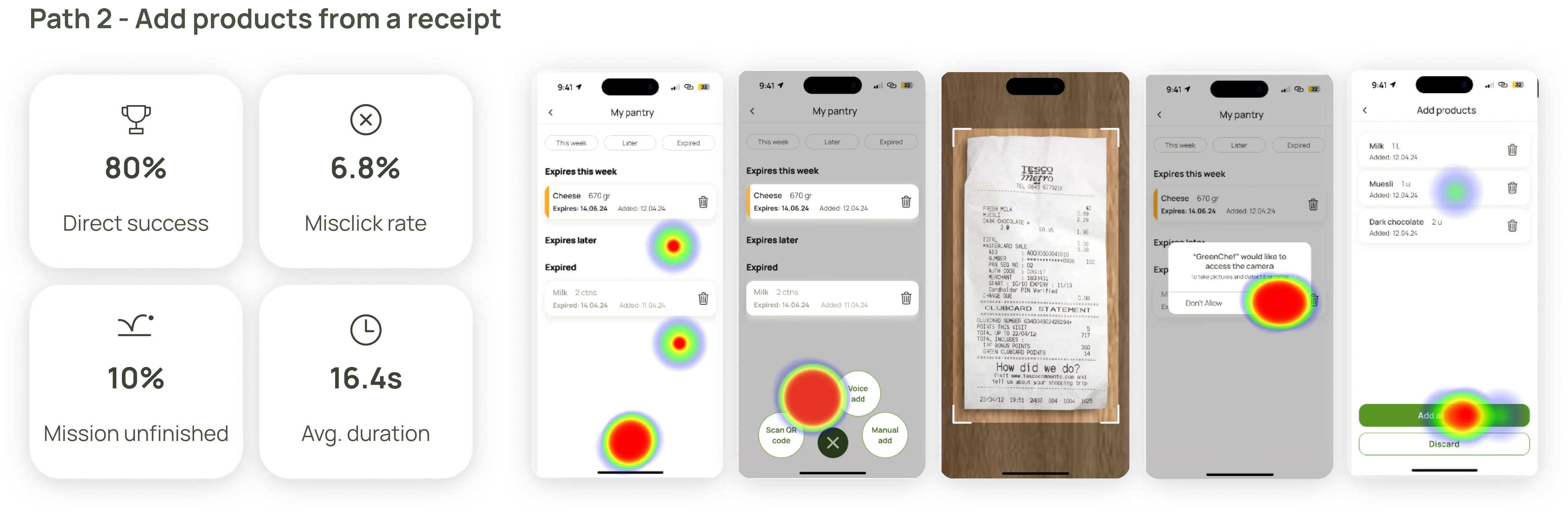
My cotribution was in multiple aspects of high-fidelity prototype development, focusing on the mobile Home screen, My Pantry flow, Onboarding flow, and desktop My Pantry, Sign Up/Login, Donate, and Recipe Details page. I also reviewed the app regularly to ensure the proper implementation of the design system and prototype functionality.
I was responsible for preparing the My Pantry flow for user testing, setting up Maze tests, and leading the moderated testing. The analysis of results was a collaborative effort.
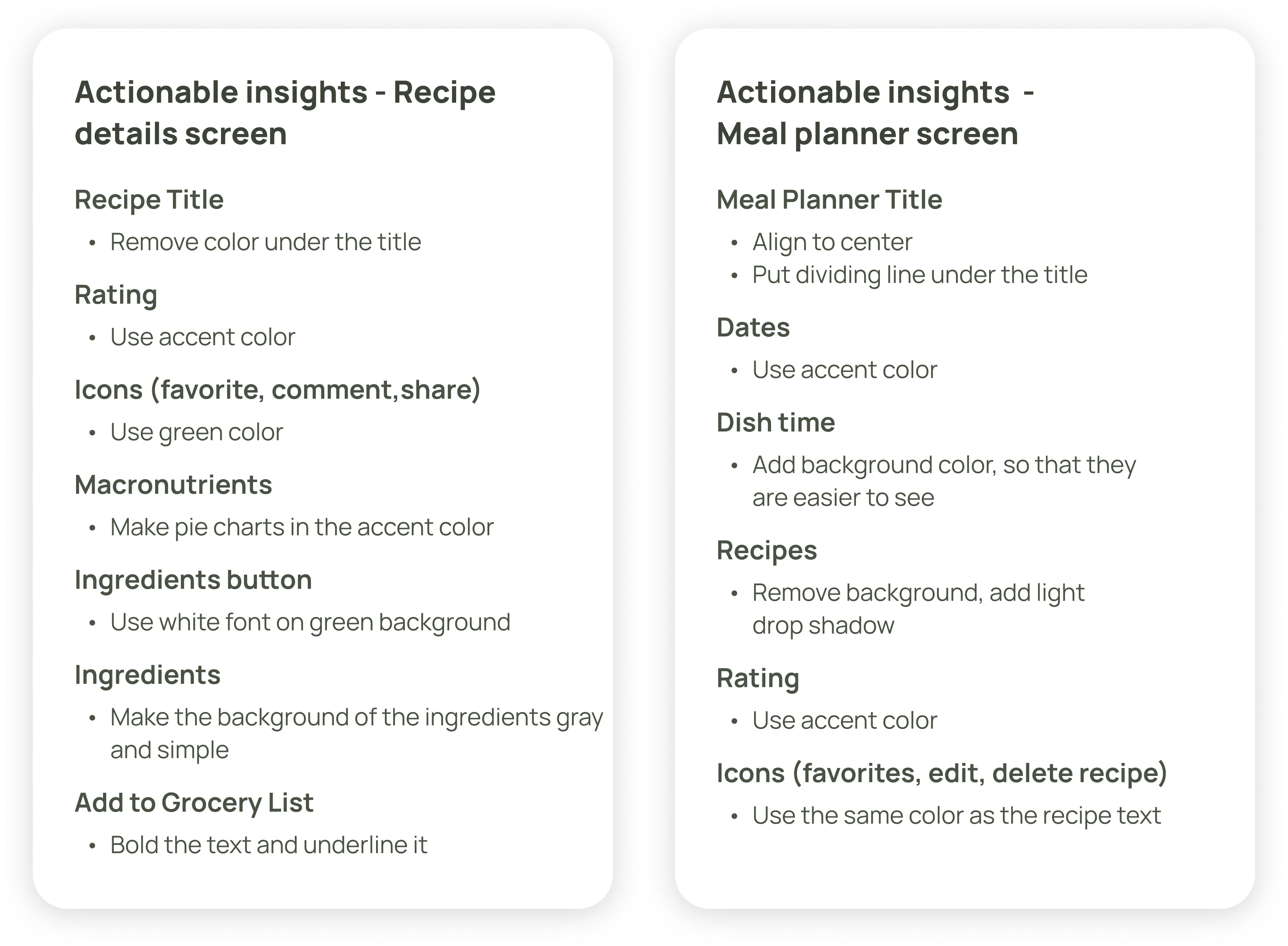
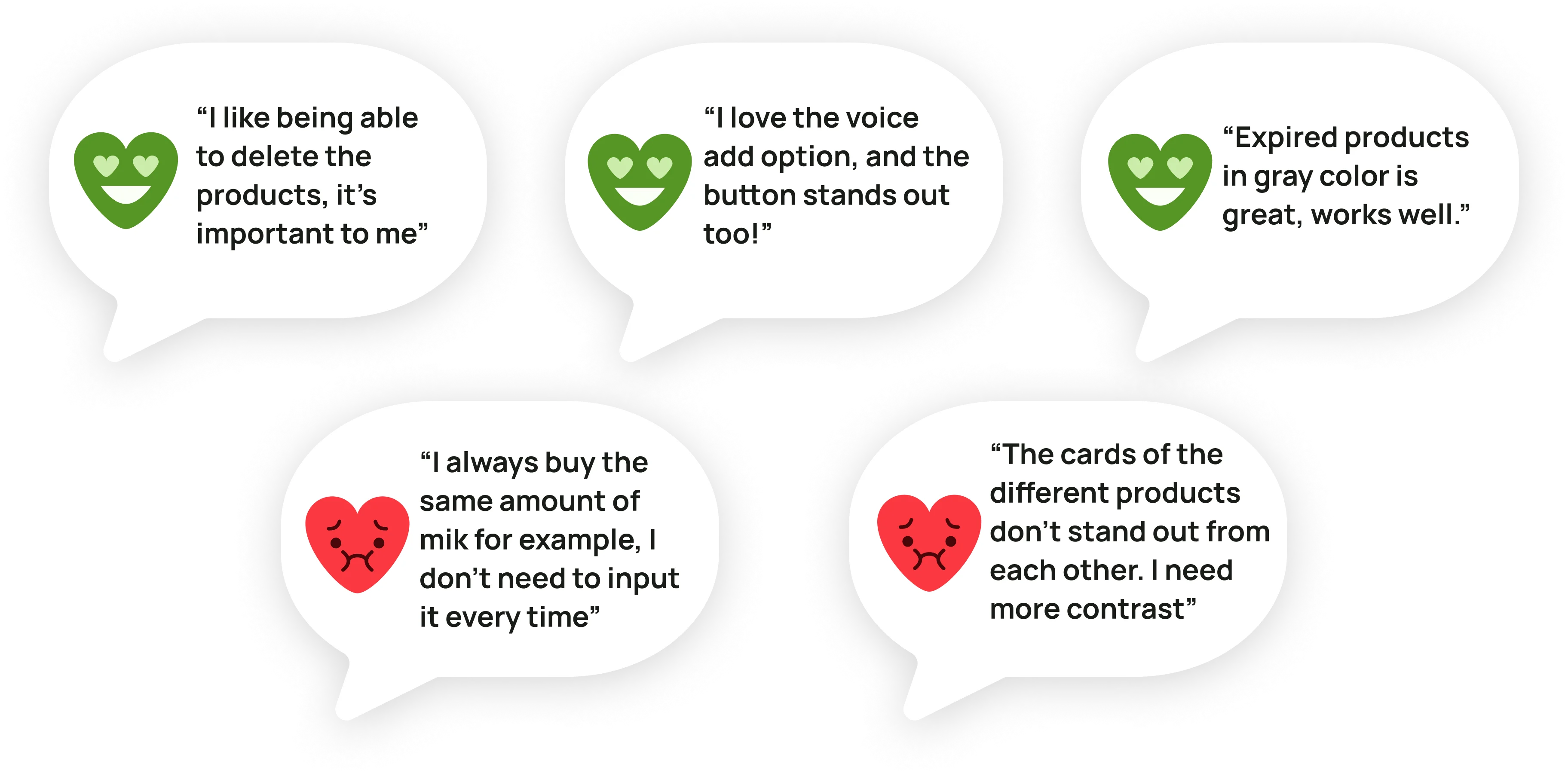
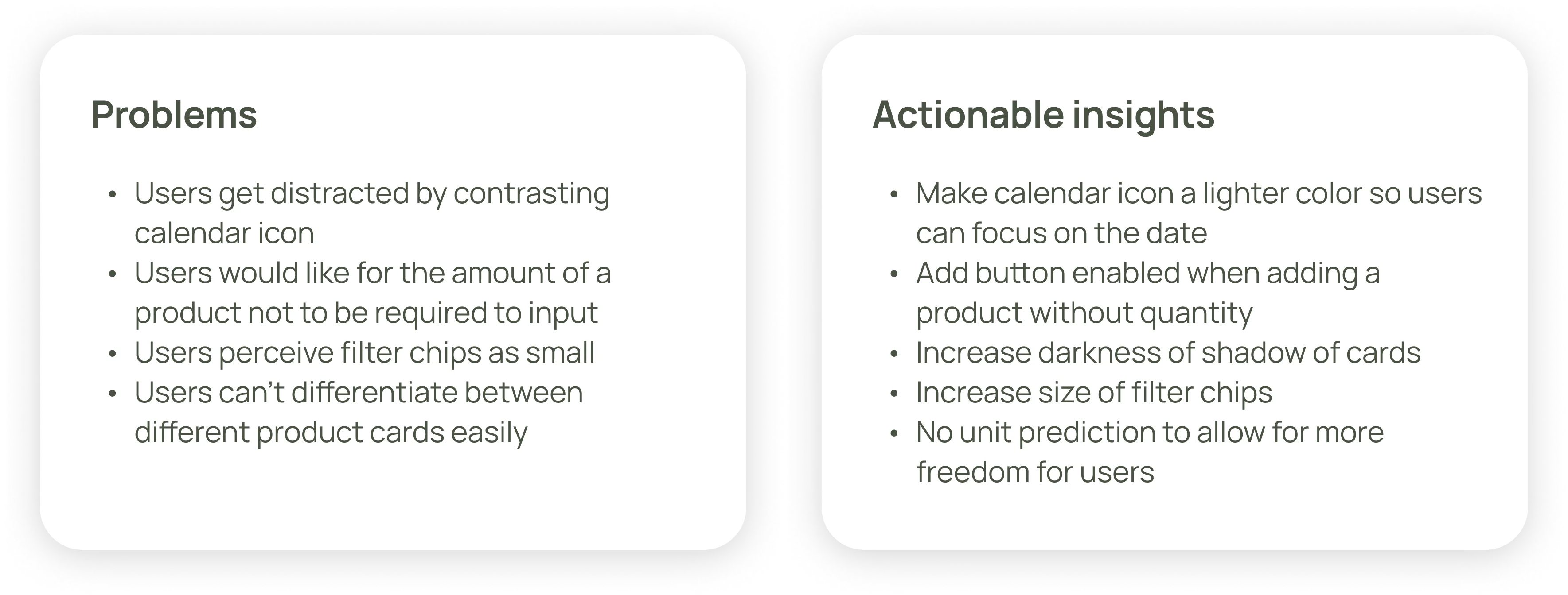
Below is a 'before and after' comparison, showcasing the actionable insights we gathered from user testing and how they were applied to improve the screens.
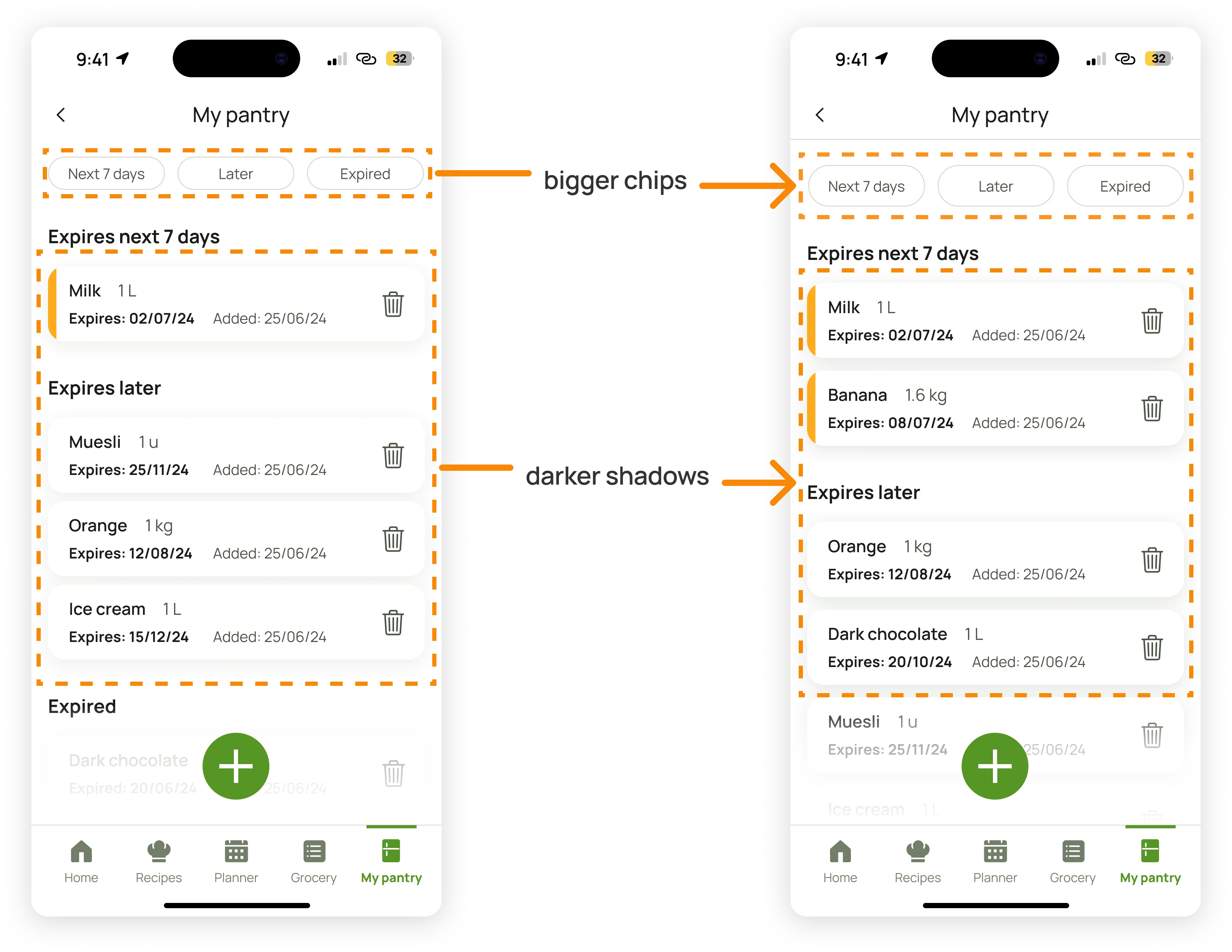
Before and after of the main My Pantry screen
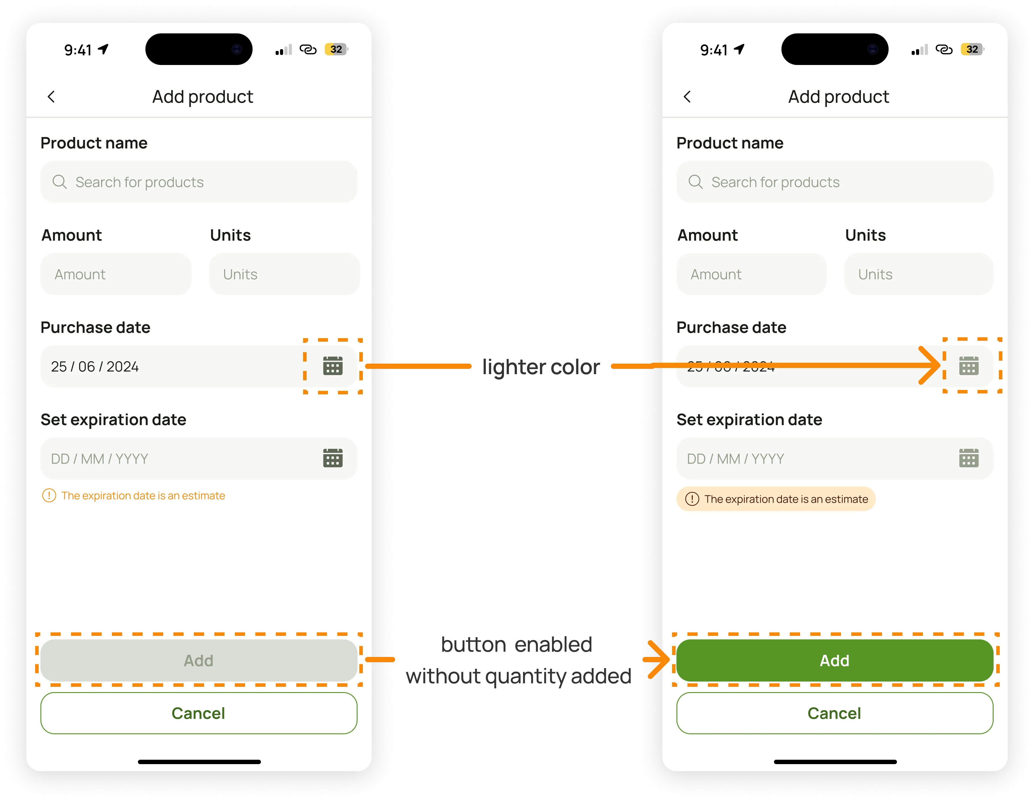
Before and after of the Add product screen
UI history of the main My Pantry screen
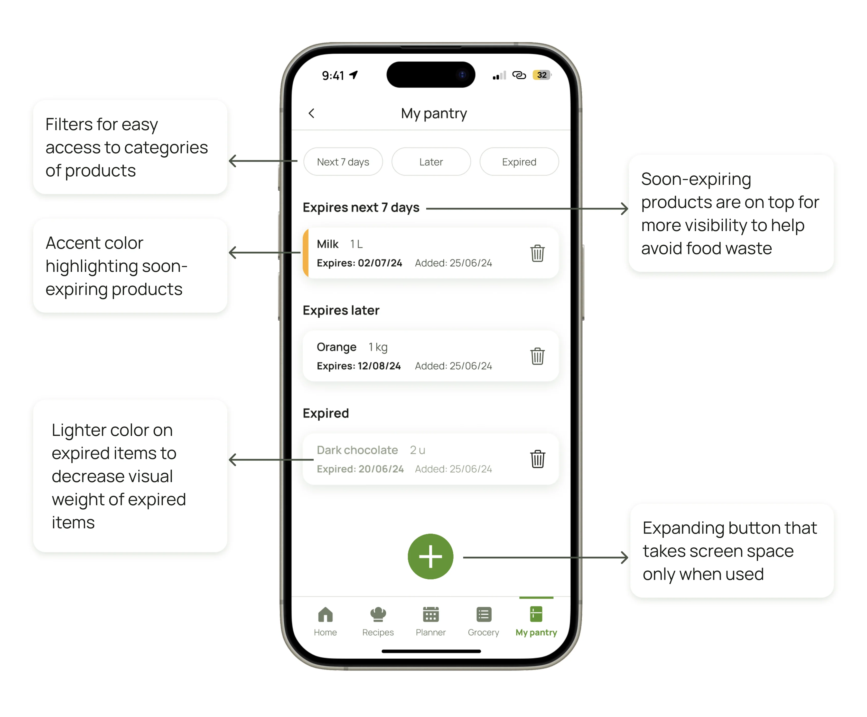
Screens from My Pantry functionality
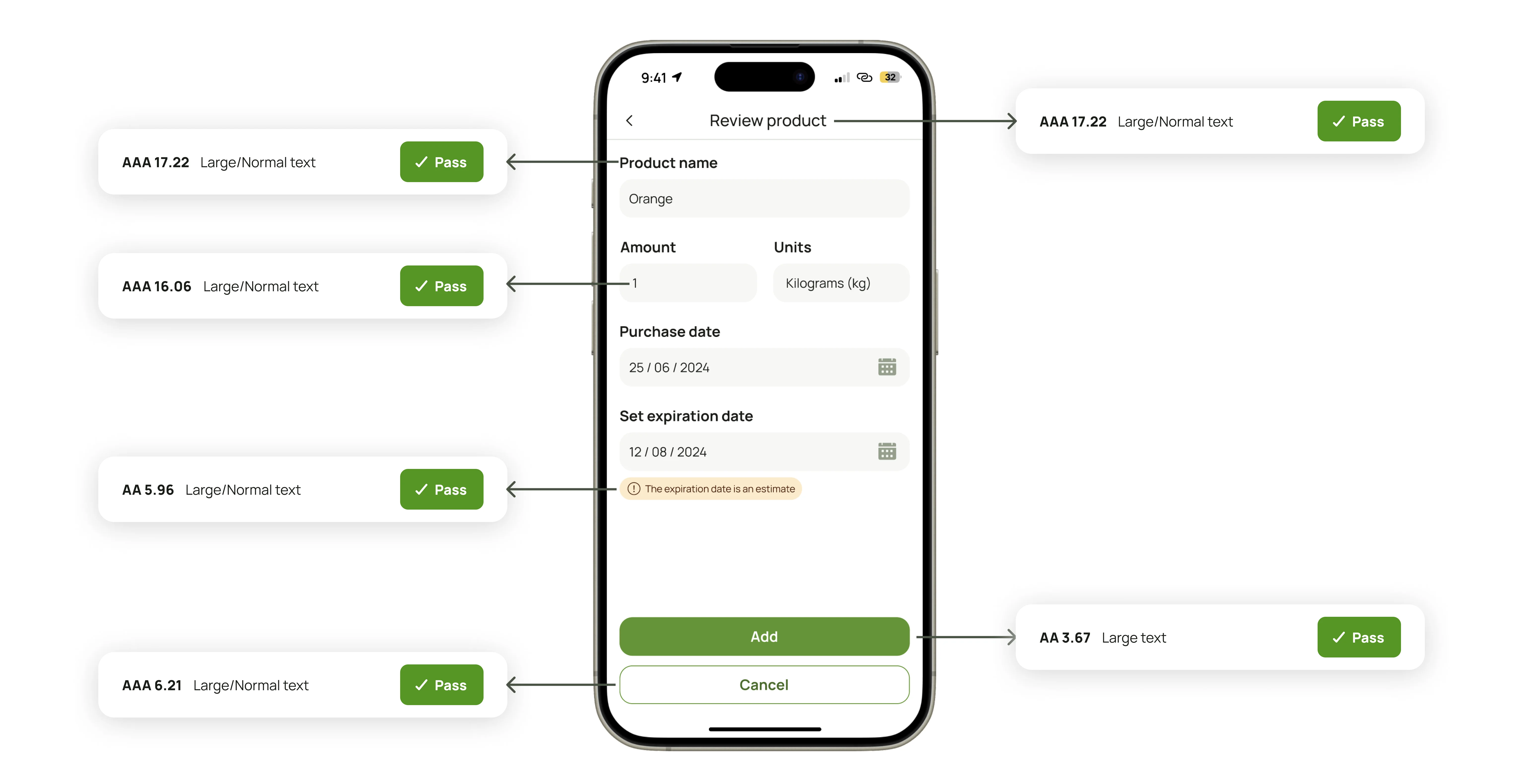
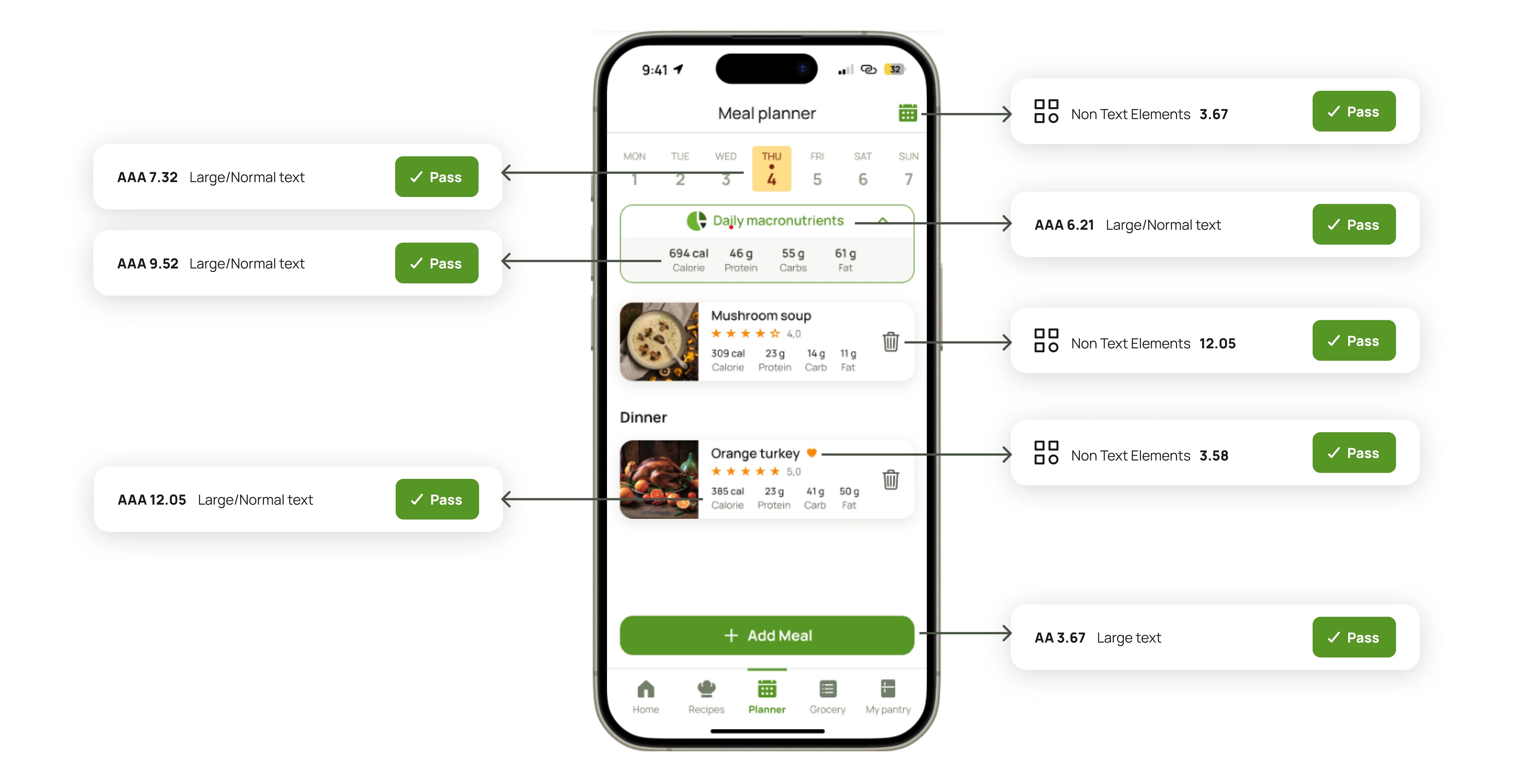
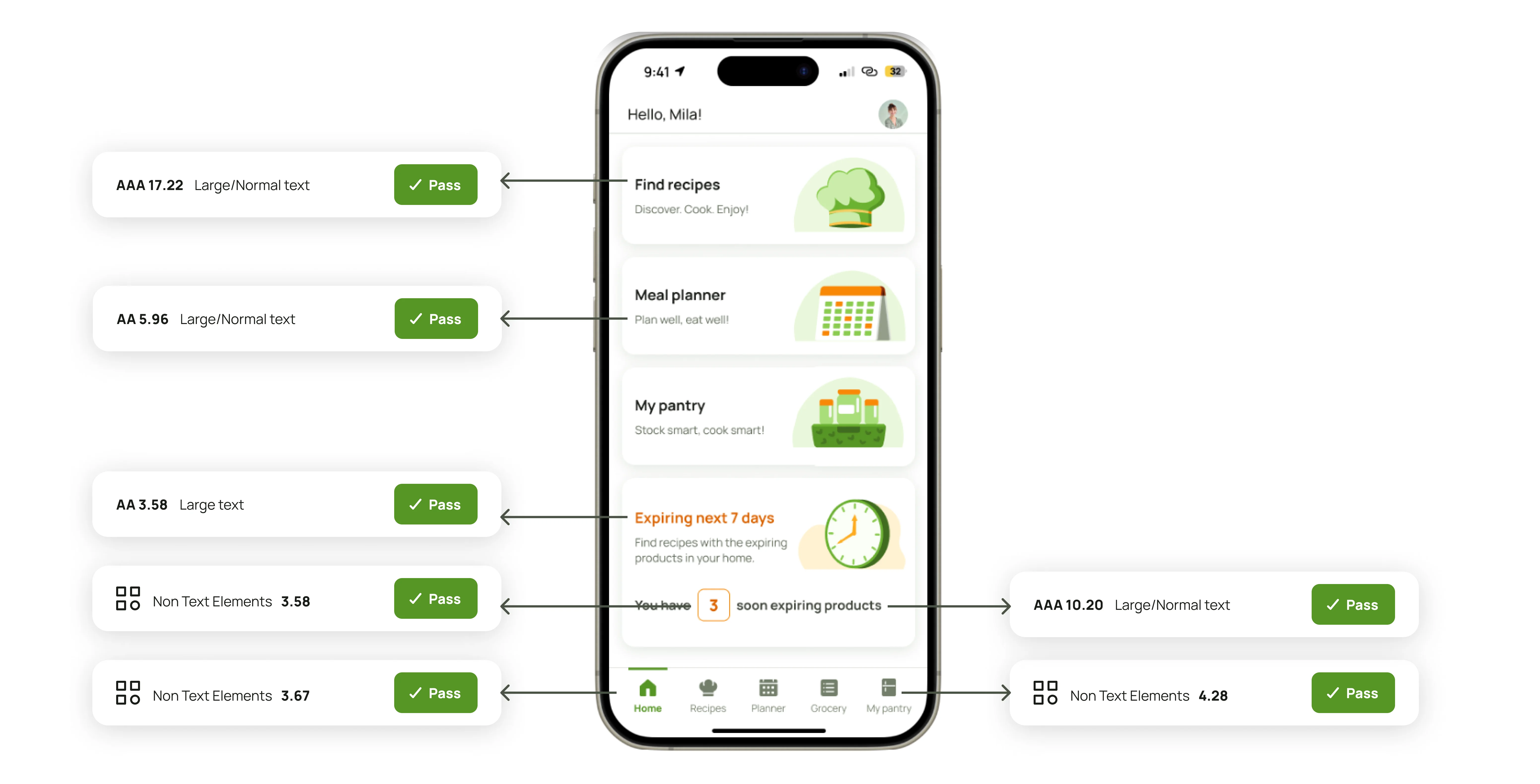
Accessibility, a key priority for us, was something I was particularly passionate about
We rigorously tested colors, contrast, and entire screens to ensure that people with vision impairments could navigate the app with ease.
Color blindness tests of screens
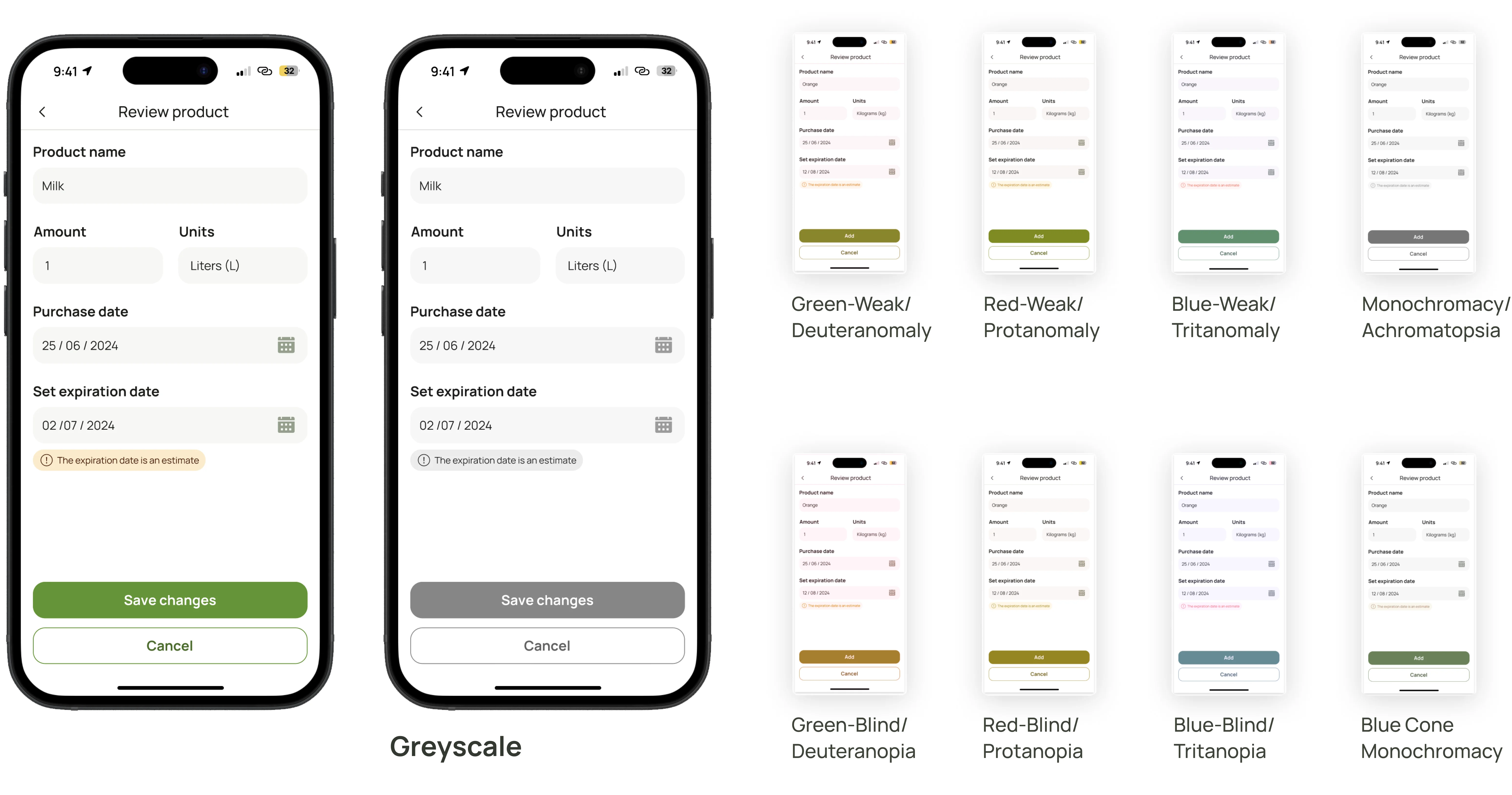
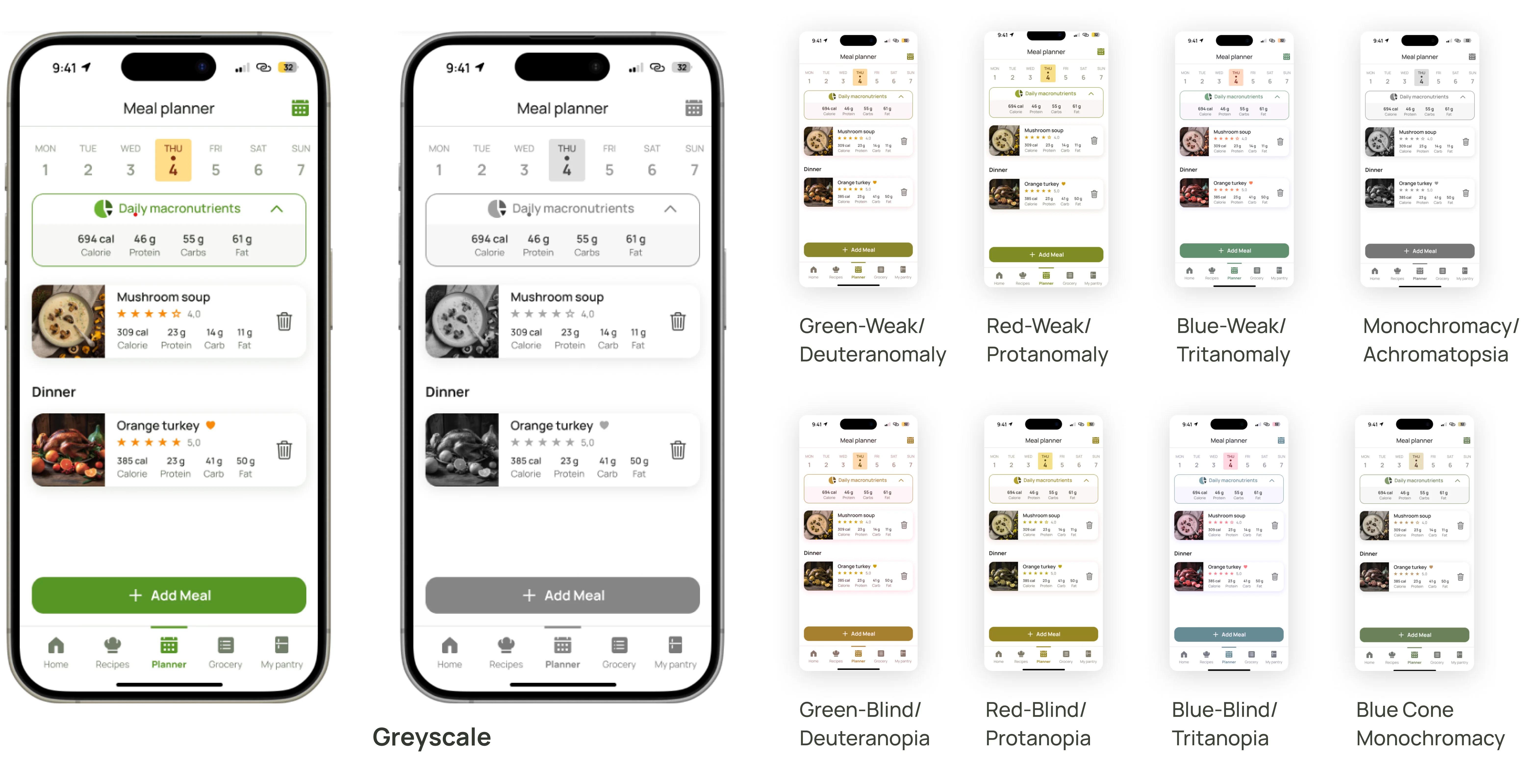
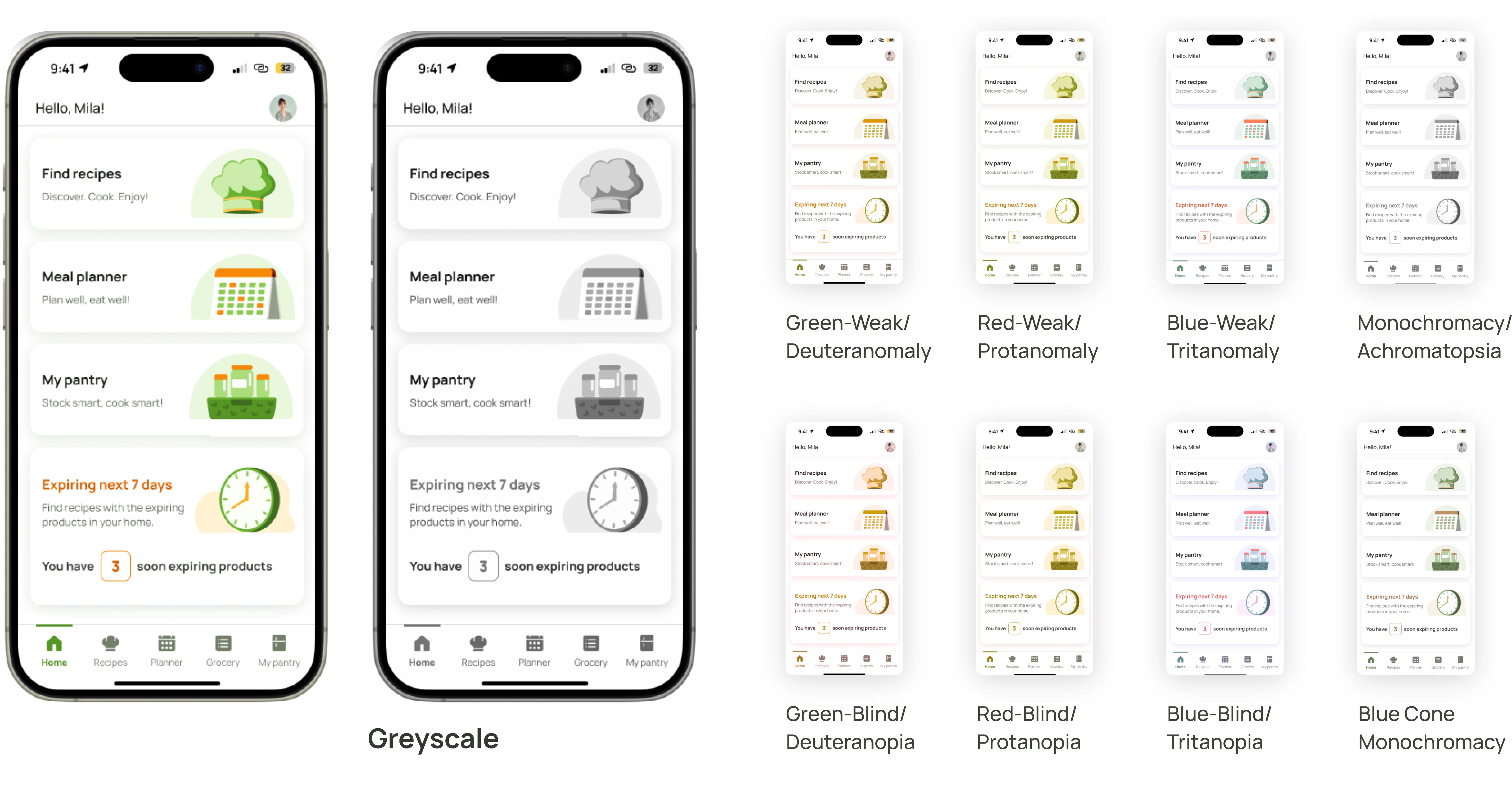
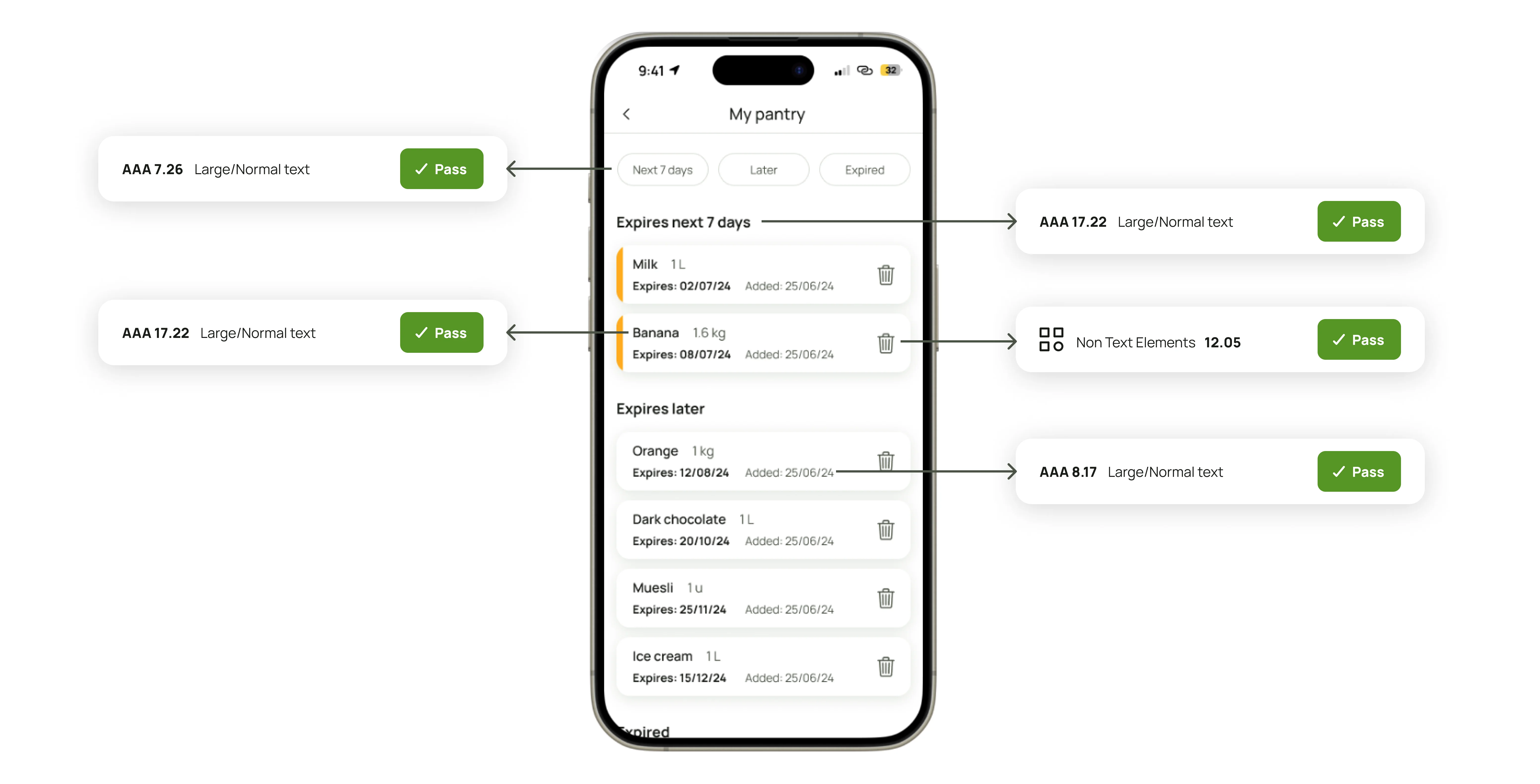
Screens contrast check
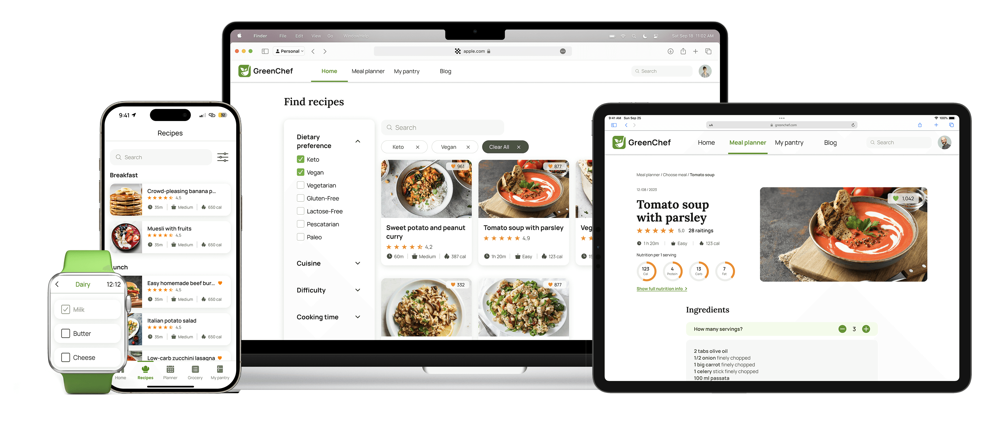
Final product - 6 mobile flows, 7 web flows, smartwatch extension for Grocery list functionality, and landing page
We created an immersive app to promote healthier lifestyles while educating users about food waste. We completed all priority tasks, leaving others for future development. Hi-fi mobile flows were developed for My Pantry, Recipe Finder, Meal Planner, Grocery List, Account, and Onboarding. Web hi-fi flows included My Pantry, Recipe Finder, Meal Planner, Donation, Account, Blog, and Sign-up/Log-in. Additionally, we created a limited Grocery List extension for smartwatches.
Conclusion
Lessons learned
Incorporating user feedback: Early in the project, we recognized the importance of user feedback and committed to extensive testing. The results greatly enhanced the project outcome and highlighted the challenges of crafting effective testing questions and environments.
Collaborative excellence: Working together sparked creative moments by leveraging our diverse design backgrounds. The support and knowledge-sharing contributed significantly to my personal and professional growth, making the experience enjoyable and rewarding despite initial challenges.
Skill improvement: This project helped me enhance my Figma skills in prototyping, component creation, and auto-layout. With guidance from experienced designers and research, I quickly adapted these skills, underscoring the value of peer learning for future projects.
I’m grateful to have been part of this program, working with a diverse team. We started as strangers but learned to collaborate and achieve results we’re proud of. Of course, no designer is ever fully satisfied—there’s always room for improvement.
What’s next?
I’m excited to have found a field that blends my passions—from user-centered design and accessibility to visual aesthetics. This program and project reignited those interests, and I’m eager to continue growing as a versatile designer.